Your iPhone comes with powerful assistive technology (AT) built in—useful for checking how well your mobile app is supporting accessibility. When mobile apps don’t work well with one AT, they often don’t work with others.
What is Full Keyboard Access?
On iOS and iPadOS devices, people can use a Bluetooth keyboard to interact with the device by enabling Full Keyboard Access (FKA). FKA allows a person to navigate the UI with a keyboard only if the app has been configured properly with interactive elements.
Supporting FKA means ensuring all buttons and controls in mobile apps gain keyboard focus in a logical order, have a visible indication of keyboard focus and can be activated with the keyboard. iOS has some limitations on scrolling content that is not interactive. FKA users must be able to perform all the same actions as tap users without FKA enabled.
Enabling Full Keyboard Access on iOS
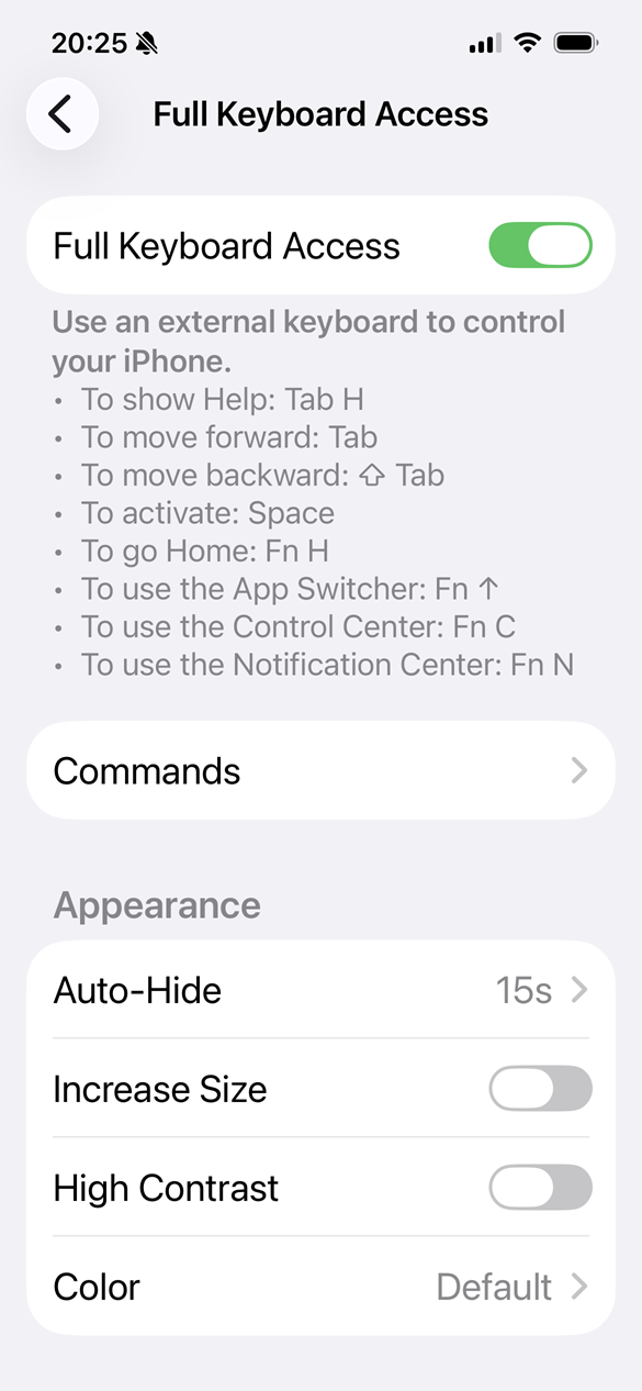
Settings app > Accessibility > Keyboards & Typing > Full Keyboard Access > Toggle the Full Keyboard Access switch on or off
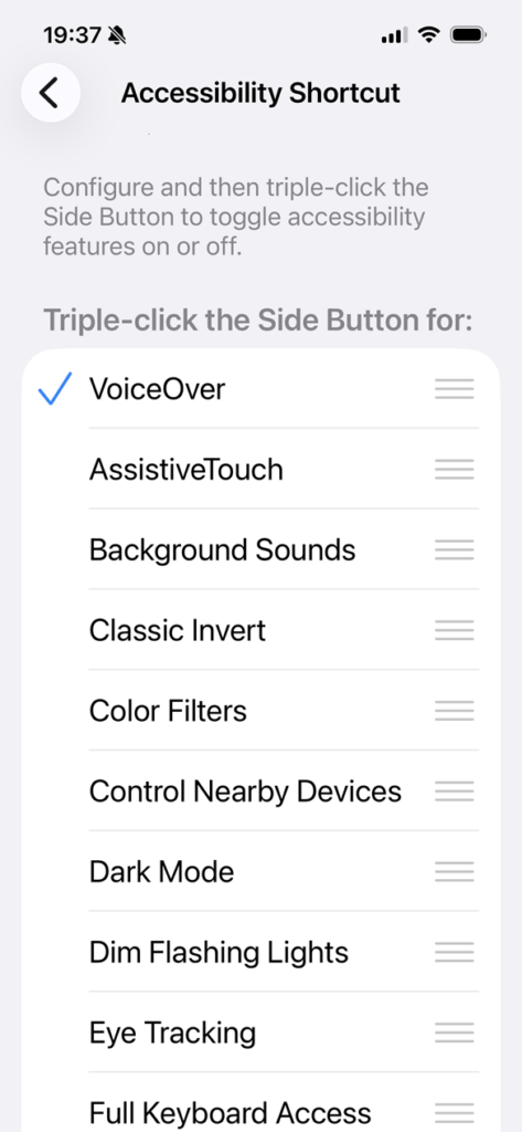
FKA is a setting you can leave on all the time once enabled. You can also add it to the Accessibility Shortcut menu to turn it on and off quickly. Pair a Bluetooth keyboard with the device to use it with iOS. By default, a blue keyboard focus indicator will appear around active groups. Active controls will have a light blue overlay.

Using a keyboard
Using a keyboard with iOS/iPadOS is very similar to using a keyboard with a desktop machine. When in doubt, try navigating with arrow keys. For more information on using a keyboard, check out these common keyboard shortcuts.
| Keyboard stroke | Action |
|---|---|
| tab / shift tab | Moves keyboard focus forwards and backwards |
| arrow keys | Move focus around the active group |
| space | Activates buttons, links, controls |
Keyboard navigation example
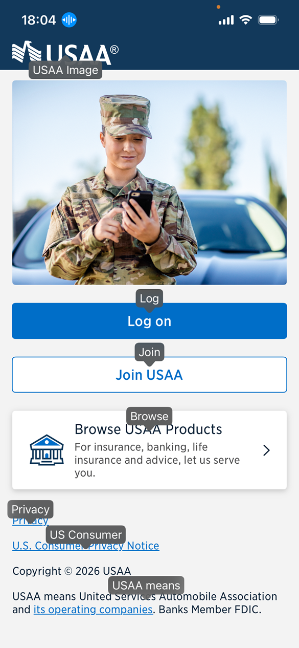
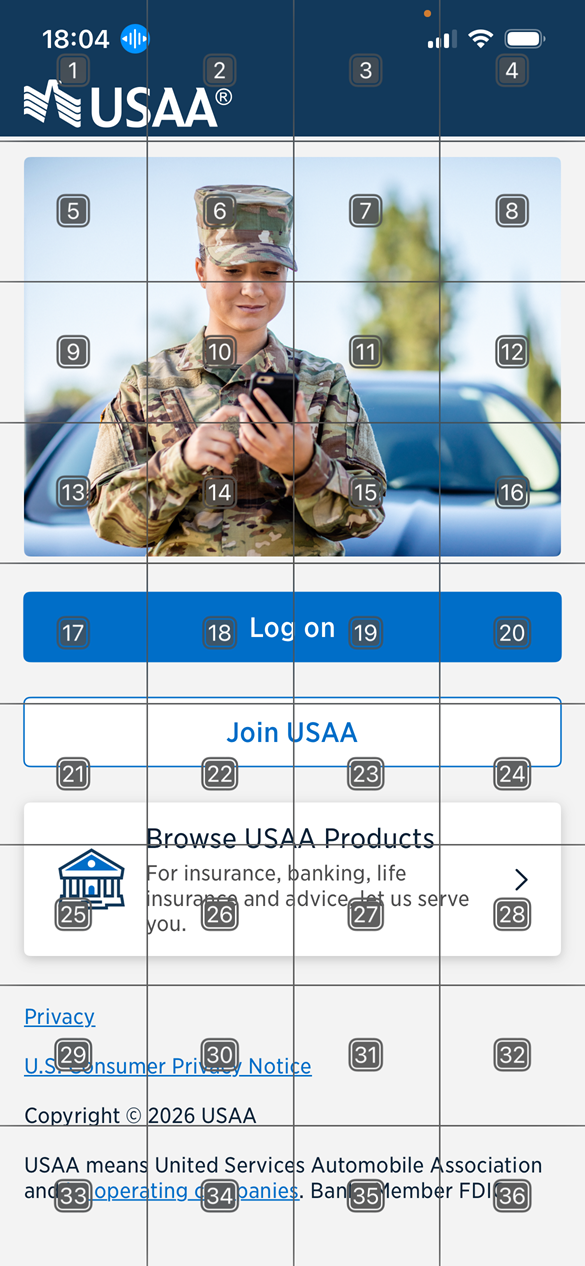
A keyboard user opens the USAA app to the landing screen. She uses the TAB key to move focus from the USAA logo to the content area. She then uses the DOWN arrow key to move focus through several buttons and links on the screen. She lands on the “Log On” button and presses the SPACE key to activate the button.
The screen switches to the Products screen with a heading, close button and four products to choose from. She use the TAB key to move focus from the “close” button into the content area. She then uses the DOWN arrow key to move focus between the four buttons. She moves focus back to the “close” button and uses the SPACE key to return to the landing screen.
Related articles
- 4 iOS display settings to check your app with
- AT for iPhone: VoiceOver screen reader
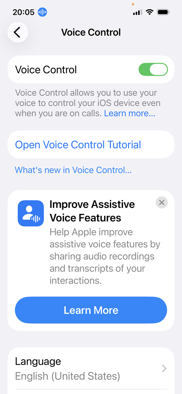
- AT for iPhone: Voice Control speech input
- AT for iPhone: Full Keyboard Access
Screenshots and videos taken on an iPhone 16e running iOS 26.4.