A year ago, I started a side project called Postcard Resistance in response to calls for writing the President and members of Congress to protest several issues. The premise is simple:
All you need are a printer, paper, pen and postage to make a difference.
The site provides several PDF templates anyone can download and print to create four postcards per 8.5″ x 11″ piece of cardstock. The front contains artwork about an issue or general premise, e.g. RESIST.
Postcard front – RESIST
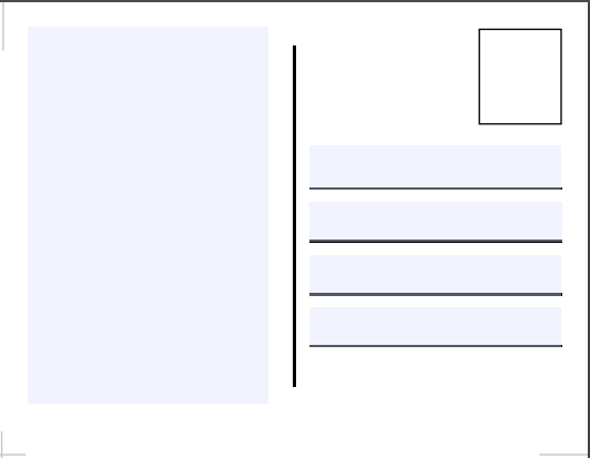
On the backs, I created form fields where people can easily type up a message and add the name and address of recipients. This allows mass printing of ready-made postcards waiting for a stamp.
Postcard back
My goal was to spin up a simple, responsive site quickly. I decided that instead of creating something from scratch, I would use a template. W3 Schools provides a variety of templates for free. I began with the Start Page Template and modified it with code from another templates to display the postcard fronts in a photo gallery array.
Postcard Resistance website
There’s always some code bloat with a template but I was pleased with how efficient the CSS is and the ease with which using a grid-based layout worked. I’m looking at using something similar to update my portfolio site.
The ongoing creative outlet of making new postcards is my favorite part of the project. Most are my ideas but a few were adopted from images on the web and converted from JPGs to vectors for the PDFs. Upcoming ideas include
Net Neutrality
Registering to vote
Retirement cards for MoCs facing reelection in 2018
Another accessibility disaster. It’s great that people are finding creative ways to use JavaScript but it is not okay to ignore progressive enhancement techniques.
Your users should never see this instead of content:
Our site requires javascript, please enable javascript and refresh the browser window.
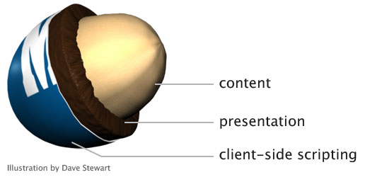
JS frameworks do a disservice to the Web after all the innovation and hard work that has gone into creating a separation model for content, presentation and client-side scripting.
Layering content, presentation and client-side scripting – Drawing by Dave Stewart
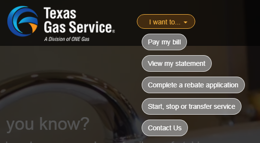
The Texas Gas Service website gives us lots of examples. Let’s see how well we can use the site without a mouse, a.k.a tabbing through.
(Step 0: What is with this trend to play videos as background images? I thought we learned this lesson years ago. Having movement your users can’t disable is annoying and bad practice. Stop it.)
Texas Gas Service homepage
Links I can’t click; let me count the ways From the “I want to…” select menu to the hamburger menu to the footer, dozens of “links” are not marked up as <a href> and cannot be tabbed to, nor would they be read as links by a screen reader.
These aren’t links
This is lazy and wrong. If something is a link, make it a link. Fake links achieved with JS only are a large accessibility barrier.
Tabbing order fail
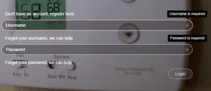
The tabindex attribute can be a really useful tool. It can also completely screw up a user’s ability to access important information, like the “username” field. When I could not tab to the “username” field, I looked at the code and saw the field was set to tabindex=-1. I had to look this one up. Here’s a 2014 explanation from The Paciello Group:
When tabindex is set to a negative integer like -1, it becomes programmatically focusable but it isn’t included in the tab order. In other words, it can’t be reached by someone using the tab key to navigate through content, but it can be focused on with scripting.
From my perspective as a customer who visits this page, being able to log in is the number one user story but it isn’t possible using a keyboard.
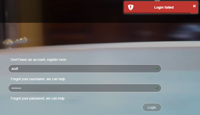
Form validation errors The only time the “username” field seems to get focus is if that field is empty when clicking the “Login” button. Plenty of client-side field validation solutions work without removing a field from the tabbing order.
Login form validation errors with login button disabled
If a user tries to login with bad data, a small modal window with a an unhelpful developer-style error message of “Login failed” appears at the top right of the page. There is no associated help text about the causes of the error, or which fields have errors, and focus is removed from the form making it that much harder to update the data.
Login failed error modal window
Adding to the confusion is the little green check in both fields indicating what would usually mean the field data is valid. But for this form, a green check merely indicates that a field isn’t blank. There isn’t any robust client-side validation occurring at all.
Pet peeve: What is the point of removing the browser scrollbar from the page? It provides a simple and useful way to indicate where I am on the page. This is something I really miss on mobile devices.
So easy to get right, yet so often poorly constructed.
Today I came across this gem with a contrast ratio of 1.26:1, as in barely above 1:1 which is invisible. Gray on white should always have contrast checked.
Other form infractions include
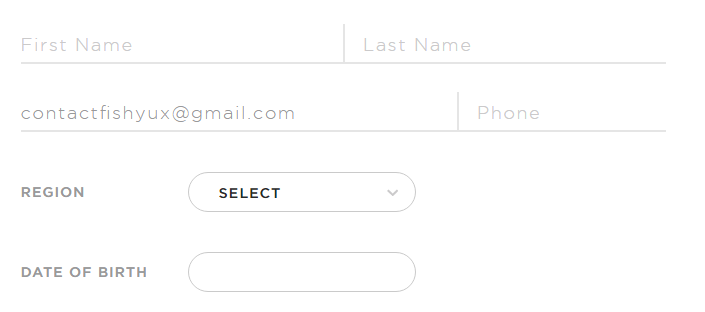
Using placeholder text as labels. Once a user starts typing, it’s no longer clear what information was requested or what format the data should be in.
When tabbing through the form, there is no visual indicator when you’re on a select field or a button.
I just don’t see the point in trying to reinvent the form experience. In this case, they’ve chosen a skeuomorph design, attempting to recreate a paper form experience digitally.
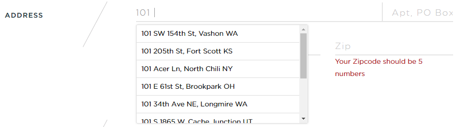
I like the address suggestion but it’s not possible to tab to it and select anything.
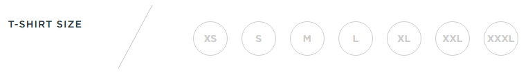
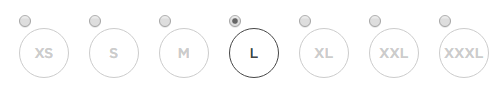
I could not tab through the t-shirt size options and select anything using the arrow keys, even though these were coded as radio buttons. Using the browser inspector, I unhid the radio buttons and then could tell that after I made a selection, I was tabbing through the radio buttons.
It was really hard to tell if I could tab to the submit button without visual indication. Adding a button focus style with the inspector showed that it was getting focus.
So much has been written about the IA of good forms, the proper markup of form elements and form usability, it’s amazing to me designers don’t follow a known pattern for an account creation process. It’s not the time to get fancy.