Blog

Bad Forms – WHY?

Forms.

So easy to get right, yet so often poorly constructed.
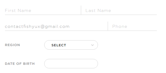
screen shot of a form fields with light gray text on white

Today I came across this gem with a contrast ratio of 1.26:1, as in barely above 1:1 which is invisible. Gray on white should always have contrast checked.

Other form infractions include

  • Using placeholder text as labels. Once a user starts typing, it’s no longer clear what information was requested or what format the data should be in.
  • When tabbing through the form, there is no visual indicator when you’re on a select field or a button.
  • I just don’t see the point in trying to reinvent the form experience. In this case, they’ve chosen a skeuomorph design, attempting to recreate a paper form experience digitally.
  • I like the address suggestion but it’s not possible to tab to it and select anything.
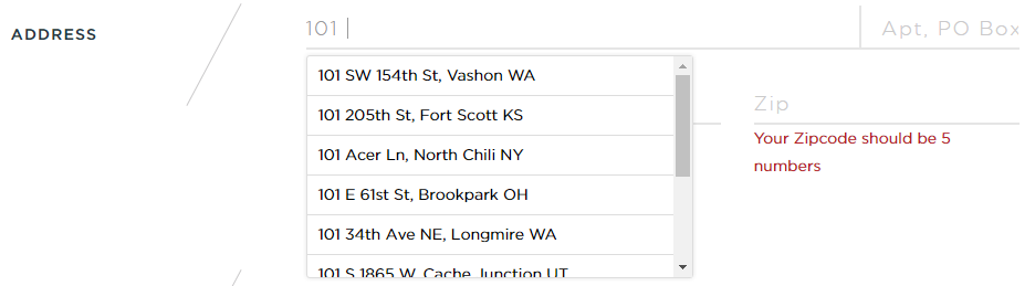
    screen shot of the address field with a drop down of address suggestions
  • I could not tab through the t-shirt size options and select anything using the arrow keys, even though these were coded as radio buttons.

    screen shot of the t-shirt form field with circles for each sizeUsing the browser inspector, I unhid the radio buttons and then could tell that after I made a selection, I was tabbing through the radio buttons.

    screen shot of selected radio button for shirt size
  • It was really hard to tell if I could tab to the submit button without visual indication. Adding a button focus style with the inspector showed that it was getting focus.

So much has been written about the IA of good forms, the proper markup of form elements and form usability, it’s amazing to me designers don’t follow a known pattern for an account creation process. It’s not the time to get fancy.
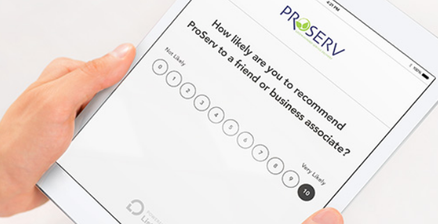
Feedback Request – Listen360

This week, I received an automated email with the title “Business Name – Feedback Request” containing a sort-of likert scale asking how likely I’d be to recommend them to a “friend or business associate”.

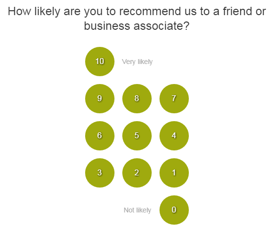
Numbers 0 - 10 rating scale shaped like a keypad
Likert scale keypad design

My feedback on this survey design from Listen360.

The design is just weird

I’ve never seen a rating scale in a keypad orientation. It confused me and my reaction was to ignore it because it doesn’t make sense. How do I know what the scale represents when it’s not presented in as a hierarchy?

Based on the tiny gray words “Very likely” next to 10, I assume clicking that will provide the highest rating while “Not likely” next to the 0, the lowest rating.

But what do the three rows of other numbers mean, really?

This scale literally goes to 11

Most likert scales rate 1-5 or 1-7 with the odd number of choices allowing the respondent to pick a neutral option instead of forcing her to agree or disagree/like or dislike. This keypad design goes one further, to 11, with options from 0-10.

Zero is extraneous unless it’s clearly marked “I hate y’all, never coming back. All I will do is complain about you on social media.” Providing 10 levels of “maybe I’ll recommend you” was overwhelming and unnecessary to me. Really, if you condense this down to where “9-7”, “6-4” and “3-1” are single choices, you have a 1-5 scale.

I guess this scale is standard for Listen360 as the example on their homepage is also 0-10 though at least displayed horizontally. I was not able to find anything on their methodology for using 11 options.

Horizontally aligned likert scale with ratings 0-10
Horizontal likert 0-10

I’m helping you, make it easy

This company is requesting that I give them valuable response data. I expect that clicking a number would submit the survey response, done. Instead, it becomes a three-screen questionnaire requesting more and more. After selecting a rating, a web page opens asking for a long-form response.

You’re asked “What could we do to improve?” for 0-7 or “What do you like about our services?” for 8-10.

Rating screen asking what do you like about our services?
Long form answer box

Oh, a submit button! Am I done? No…

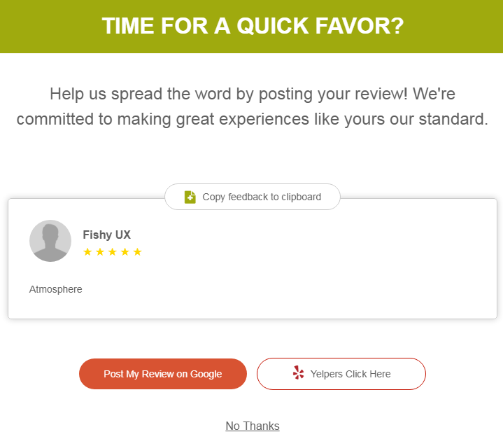
Screen reads time for a quick favor? with links to rate on social media
Rate us screen

Are you for real? Do you have “time for a quick favor?” Isn’t that what I did 5 minutes ago when I clicked a number in your email? This is like when companies sneakily check the “subscribe to our newsletter” box when you just want to buy something.

No, I don’t want to rate you… What, you parsed out my name?? I have to click “No Thanks?” Why am I thanking you?

I find this kind of feedback baiting disingenuous. It began by asking if I’d recommend them, not how my experience was, and ends with an overt “LIKE US” ploy.

My feedback is, don’t send me this crap. It decreases my opinion of your company and makes me much less likely to either return to your business or to recommend you to anyone.

Two Years

Wow, it’s been two years since I started this project.

Most posts take a lot longer than I expected them to at the beginning. The amount of dissection, research, design suggestions and mock-ups required for even small issues end up being fairly in-depth. I’m glad I started this blog and I’ve found it very useful.

I started a companion Twitter feed as a way to disseminate my writing. It’s also good for the occasional quick design observation.

So much of what I do for work involves progressive updates to existing interfaces, rather than creating new designs. Looking at small pieces of other systems proves useful for exercising a critical eye for often overlooked elements and processes. At heart I’m an information architect (I did go to library school!) more than a designer.

This air freshener was in a bowl of candy at my vet’s office. I totally thought it was a dog treat. Context matters 🙂

photo of a dog face air freshener with the words fresher dog breath brought to you by Greenies
Fresher dog breath brought to you by Greenies