I’ve never used Flipboard, so I decided to make my first visit an opportunity for a preliminary accessibility audit based on the WAI Easy Checks – A First Review of Web Accessibility heuristics.
It was a challenge to get the site’s source code because everything is rendered on the fly with JS. I had to use the Chrome inspector and copy/paste the code into an HTML file for upload to the W3C validation service. (And there is no fallback for users without JS.)

The validation service returned many errors, but this audit explains three basic accessibility problems.
1) Images Lack Text Alternatives
So basic yet so overlooked, the home page images don’t have alt attributes. This includes both images that are linked and not linked.
For linked images, lack of alt attributes means a screen reader has no context for the link; it’s like a link without text. For all images without alt text, the screen reader will read the file name, which provides little to no context for the element.

This is the rendered HTML for the National Geographic square:
<a class=" splash-tile partner" href="/section/national-geographic-ga7unkc6sb3qhid0?intent=invite"><img class="background-image" src="https://images.nationalgeographic.com/wpf/media-live/photos/000/898/overrides/sheep-grazing-judean-desert_89872_990x742.jpg"><img src="https://cdn.flipboard.com/dev_O/featured/svg/logo_natgeo_dark.svg"></a>And this is how a screen reader would interpret that HTML:

Always include the alt attribute in the <img> element. If the image is there for visual design only, include an empty attribute alt="". For images that provide contextual information to sighted users, provide meaningful descriptions of the contents.
Flipboard.com also uses a lot of SVG, none which is accessible because there are no <title> or <desc> elements used to provide text alternatives for these graphics. For example, the Flipboard logo shows up as an empty link. SitePoint has a great article on how to create accessible SVG.
2) Form Fields Lack Labels
The sign up form on the homepage relies on placeholder text to do the job of field labels. The problem with this approach is that labels provide context for form fields that placeholder text can’t. Further the poor color contrast with the light gray text on a white background does not meet accessibility standards with a ratio of 2.28:1.
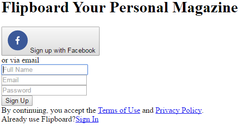
Labels don’t have to be visible, accessible by screen-readers only, but relying on placeholder text makes it difficult for users to remember what data to enter after they start typing; this is probably not a big deal for a three field form, but it’s a good idea to be consistent. This form could change the placeholder text into field labels while maintaining the same visual design.

This form does deserve some props for using a “Full Name” field instead of two fields for first name and last name, and for not having a “Confirm Password” field.
3) Poor Keyboard Access and Visual Focus
Many people cannot use a mouse (or finger) to navigate websites and rely on keyboards or assistive technologies to move between links. For this to work, links must
- provide sufficient visual queues when they are in focus, and
- be a logical order within the source code that closely matches the natural reading order
The simple litmus test for this is to try to tab through a site. I had a lot of trouble with Flipboard because none of the links had visual focus. For example, the “Sign In” link in the upper right changes background color on hover, but not on focus; so when users tab to this link, there is no visual indication of where they are on the page.

Further, the “Sign In” link looks like it’s the first or second link on the page, but it’s actually the 12th link, requiring users to tab through the sign up form before they can sign in to use the site. That link needs to move up in the source code to be more readily accessible.
Some content is hidden from some users
Looking at the homepage with CSS disabled, I noticed two things that cannot be reached by everyone: a search box and a “Sign In” option that opens a modal window.
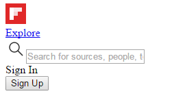
All content must be accessible to all users. While users can tab to the search box, it remains invisible on focus to keyboard-only user and it lacks both a field label and a form submit button. Ironically, search appears to be more accessible to screen readers than to visual users because I didn’t see search on the page.
The “Sign In” option functions as a link but is not marked up as a link.
<div role="button" class="tab-item login-button" data-
reactid=".0.$/.0.2.3:$signintabitem">Sign In</div>
Because it is not an <a>, users cannot tab to this element; it’s not really a link. I see this all the time, and there are several more examples on the Flipboard homepage. In my experience, this is lazy coding in a JS framework.
Recommendations
These three issues are just the beginning. The site does not make use of ARIA role attributes for navigation, proper headings for the document outline, or pass a logical structure check of the HTML. Flipboard needs to work with an accessibility expert to make its site inclusive. This web accessibility checklist is a good place to start.