Blog

5 Ways Buying Alamo Drafthouse Tickets Online Fails

The Austin-based Alamo Drafthouse movie theater chain has moved to assigned seating and the ability to reserve tickets through online ordering. I went through this process for the first time over the weekend and ran into several usability problems.

1) Field types are not marked

screenshot of an online form for reserving movie tickets
Screenshot of the Alamo Drafthouse online ticket form

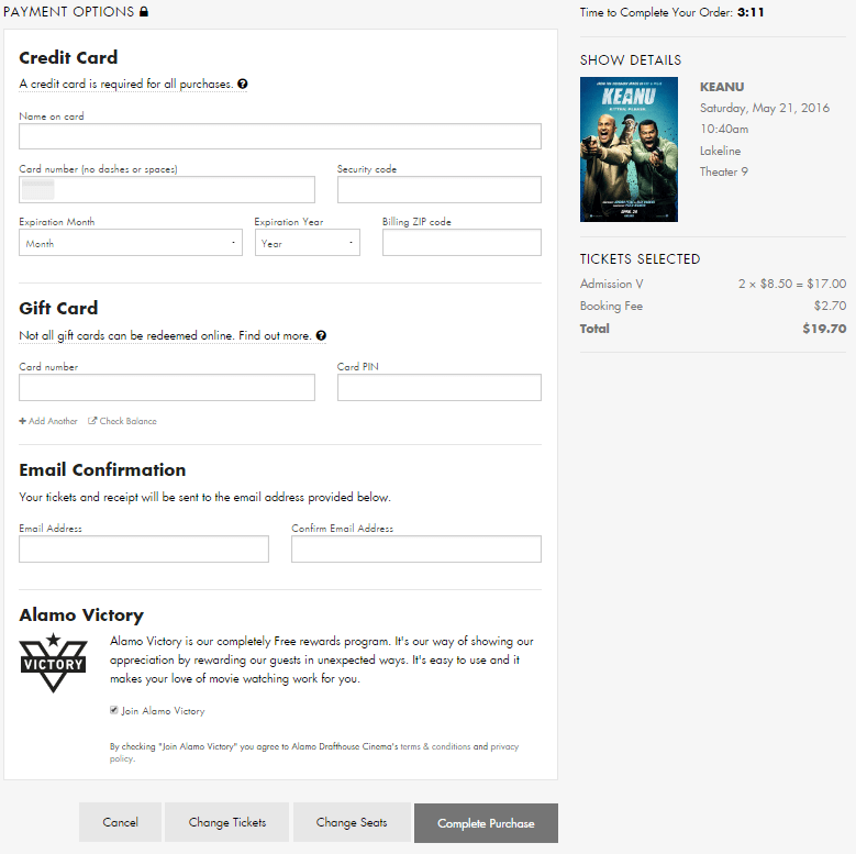
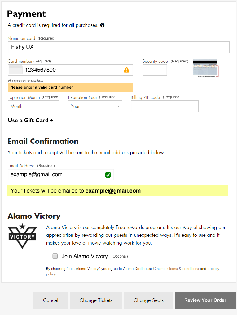
This one is so basic. I’ve done enough online ordering that I assumed the payment fields are all required, but that’s not a given for every user.

In the “Email Confirmation” section it’s unclear that an email address is required for making a purchase. It looks like an optional choice as I have no reason to believe I won’t get access to my tickets immediately after paying, but failing to enter a valid email address in two different fields results in an error after submitting the form.

Recent e-commerce research suggests that marking all fields, required or optional, improves the customer experience.

2) Poor error messaging

There is no immediate feedback when a user enters invalid data. I typed in my credit card number incorrectly and only after trying to complete the purchase did an error message display. However, the error was located at the top of the form, out of sight, as I sat there frustrated and wondering what was taking so long.

screenshot of a form error message reading credit card number is not valid or is not an accepted card type
Screenshot of form error message

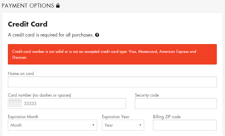
Eventually I scrolled up the page and saw the error message, but it didn’t indicate which field was in error by either putting the error in context of the field or by making the text of the error specific to the data issue.

After entering a valid credit card number, I tried submitting the form without entering anything into the other fields as a test. This took me to a new page, devoid of any branding information for the site, displaying a laundry list of what I did wrong.

screenshot of an error message page indicating all the fields that are required
Screenshot of the error message page

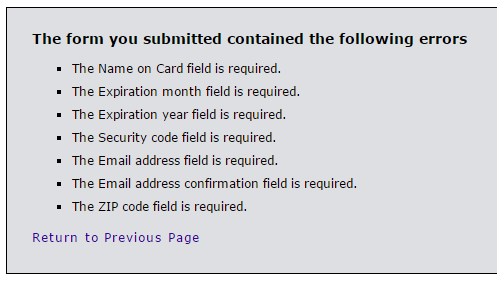
Taking a user to a page like this immediately throws up a red flag. Am I still on the right site? What’s going on? Did my credit card number just get stolen?

If an entered value contains an error, ideally do inline validation or at least display that error message in-context of the form, next to the field with the error.

Further testing showed that if the form is submitted with a valid credit card number but invalid security code, expiration date, zip code, etc., the form returns a blank page with a “card declined” error message and no way to return to the form and fix the issues. The transaction is simply cancelled without even a link back to the page where the transaction started.

There was an error with your order. Your card was declined. Your order has been cancelled and you will not be charged.

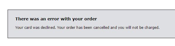
Hitting the back button provides yet another frustrating error and no way to continue with a purchase.

Error. A cinema and session must be selected.

3) Confusing payment button

The way the form submission button functions also contributed to failure. It reads “Complete Purchase” before clicking it, but after clicking it, it changes to “Completing…”

Field buttons labeled cancel, change tickets, change seats, completing...
Screenshot of form buttons

Because I had entered an invalid credit card number, my purchase wasn’t completing at all, but I sat there waiting… This button should probably be a “Review Order” button that completes all field validation. Then, the user can “Complete Purchase” from a verification screen.

4) No way to continue after timeout

If you take longer than five minutes to complete your purchase, it times out and you see another useless error message.

Your order has expired. Sorry but your order has timed out and has been cancelled. You will need to restart the process. Return to Home page.

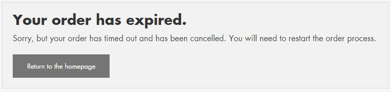
I don’t know who or how they decided to set the timer at five minutes, but I timed out because of the credit card number error message issues. Maybe they did some usability testing and five minutes is enough for most users, but for those of us who timeout, this experience should be friendly and helpful.

The goal is to sell tickets, yet this message gives the impression that the Alamo Drafthouse doesn’t care if you had trouble with the process of online ticket buying, or about helping you try again.

At the bare minimum, this message needs to be smart enough to display the theater, movie and show time you were trying to purchase tickets for and provide a link back to the start of the purchase process.

5) Optional checkbox already checked

The last section titled “Alamo Victory” takes up about 25% of the page real estate with a boring marketing blurb and an almost hidden pre-checked option for ‘Join Alamo Victory’. My favorite part is the disclaimer after it:

By checking “Join Alamo Victory” you agree to the Alamo Drafthouse Cinema’s terms & conditions and privacy policy.

screenshot of the Alamo Victory section

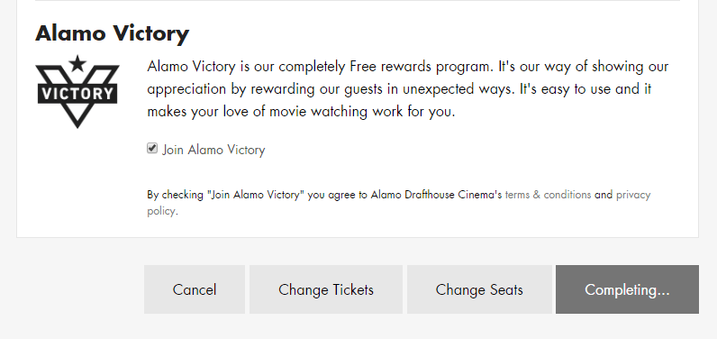
Oh really? Cuz I didn’t check that box, Alamo Drafthouse checked it for me. This is the same annoying tactic of pre-checking a “sign up for our spam emails” box on other purchases. Just don’t. Always allow me to decide if I want to join extra programs.

Design Recommendations

The online ticket purchase process needs a lot of help. I think Alamo Drafthouse decision makers would be surprised how much customers struggle with this website site if they would sit and watch some usability testing.

  1. Mark all fields as either required or optional
  2. Do inline form field validation/improve error messages
  3. Change the “Complete Purchase” button to “Review Order” so that all field inputs are validated first
  4. Provide users a way to retry a transaction that times out
  5. Remove the check from the optional field
Screenshot of recommended form updates

Fitbit Exercise Tracking is Confusing

I’ve had a Fitbit Zip for almost three years and I use the iOS app to sync the data from it. This app lets you track exercise that wasn’t captured in full by the step counter. I use this to add info about weight training and aerobics at the gym.

The active minutes, steps, and distance often do not add up when I add one of these exercises manually. The other day, I took a moderate 1 mile walk but forgot to start the tracking feature in the app. After my walk, this is what my activity looked like.

screenshot of fitbit app showing 24 minutes of activity, 5319 steps, 2.26 miles
Fitbit activity before logging exercise

My stats showed

  • 5,319 steps
  • 2.26 miles
  • 24 active minutes

After I added in my walk manually, the stats updated in an unexpected way.

screenshot of the Fitbit app showing 5,796 steps, 2.45 miles and 0 active minutes
Fitbit activity after adding a walk

My stats changed to

  • 5,796 steps
  • 2.45 miles
  • 0 active minutes

What? I can’t figure out what Fitbit is trying to do when I log exercise manually. The distance and steps shouldn’t change when those are precisely what the tracker tracks. My active minutes dropping to 0 is what I find most perplexing. How would adding exercise ever reduce active minutes?

By way of comparison, here are my stats from yesterday before and after manually logging 50 minutes of aerobics.

side by side screenshots showing discrepancies between calories and active minutes
Fitbit comparison when logging aerobics

Here we see the number of calories burned dropped by 102 while active minutes increased by 10. Again, what? I wasn’t able to find any information from Fitbit about how its software calculates these numbers but I think it’s safe to say, something doesn’t add up.

Three years later, iTunes still sucks

Last month, writer Amy X. Wang wrote a spot-on article outlining many of the issues that still plague iTunes even 13 years after it first launched.

I have avoided using iTunes at all, and only when necessary to sync or do a backup to my computer instead of iCloud. It’s been at least three years since I had it installed but I needed to do a backup and manual sync for some files after porting over to a new mobile provider.

Reluctantly, I installed iTunes 12 on my work computer. And sure enough, it still sucks due to extreme slowness and confusing IA. Per instructions from IT, I couldn’t do a restore from the backup though. It took aimless clicking around to locate my apps.

screenshot of the iTunes 12 interface showing the apps area
Screenshot: iTunes 12 apps

I had to figure out the link to the Apps area is hidden in the upper leftmenu. Then after much frustration, I saw that I needed to click a buried link labeled “Purchased” to access apps I’ve installed before. (I have never understood labeling all apps as ‘purchased’ when I’ve paid for all of five apps.)

After landing on my page of apps, which apparently shows any app I ever installed and not just the ones I currently use, I again found myself stuck. Hovering over the app icons and right-clicking didn’t provide any options or tool tips.

screenshot of the iTunes purchased apps with icons for each app
Screenshot: iTunes purchased apps

There’s a little cloud icon with a down arrow over each app icon, so I clicked one and nothing apparent happened. I tried again; I tried others; no obvious feedback. Then after clicking one, I saw a flash at the top of the screen.

screenshot showing the app downloading message at the top
Screenshot: iTunes app download message

I finally got this screen shot with some quick print screen work. While studying the image, I noticed another icon in the upper right, a circle with a down arrow. Clicking on that, I could see a list of apps I had queued for download. Only, nothing was happening. Also, why do the apps have to download to my computer for me to sync them?

I went over to the phone sync screen and saw a few of the apps I had apparently downloaded, and attempted to install them. I didn’t noticed for some time, though, that after choosing to install an app, I had to click another button hidden in the lower right.

screenshot of the iTunes phone sync apps where you install or remove apps
Screenshot: iTunes phone apps

Eventually I gave up. I went into the App Store on my new phone, found the “Purchased” apps area, and was able to quickly download the apps I wanted to use. The only thing I have to use iTunes for is creating custom ringtones. I’ve never purchased music or any other content from the iTunes store (preferring Amazon Music) and will continue to resist the Apple ecosystem.

screenshot of the iPhone App Store with icons and options to download previously installed apps
Screenshot: iPhone App Store purchased apps