Making streaming video inclusive

Updated: 9 May 2022 for AccessU

This blog article supplements the talk Making Streaming Video Inclusive, created with my colleagues Carolina Crespo and Charu Pandhi of TPGi and delivered at CSUN 2022 and AccessU 2022. The idea for this talk came from an extensive client audit we participated in: Testing a streaming video application across multiple platforms and devices. With what we have learned, we aim to contribute to best practices for creating inclusive streaming video experiences.

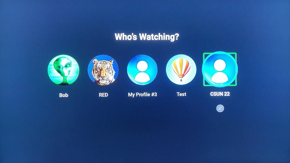
Who's watching? screen with five profiles
Select a profile screen

The state of steaming video

As of February 2022, 77% of global viewing time for video is spent watching on demand content: source.

Global viewing time for video
Type of videoTime spent watching
Live TV23%
On demand video77%
Pie chart showing people watch on demand content 77% of the time and live content 23% Live TV: 23.0 % On demand video: 77.0 %

In 2021, 78% of US consumers had a video on demand subscription. That’s a 50% increase in the number of subscribers over the last six years: source.

US consumers with a streaming video subscription
YearUS Consumers
201652%
201764%
201869%
201974%
202078%
202178%
Bar chart showing the years 2016 to 2021 as the percentage of US consumers with a streaming video service increased from 52% to 78% US Consumers 52% 64% 69% 74% 78% 78% 2016 2017 2018 2019 2020 2021 0 20% 40% 60% 80% 100%

Demand for streaming video services is not only growing, it’s here to stay as more and more providers enter the market each day. But how accessible is this flood of new apps?

Case study: discovery+

Our team had the opportunity to test the discovery+ streaming video app across multiple devices to explore the differences in implementation and the support for assistive technology built into the platforms.

We used the Web Content Accessibility Guidelines (WCAG) version 2.1 AA success criteria as guideposts for our review since separate guidelines for mobile accessibility are not yet available. Based on what we encountered during accessibility testing, we comprised a list of the top 10 accessibility concerns focused on the application UI—issues that impede disabled people from completing common user journeys:

  • Sign in
  • Explore what is available
  • Select a show to watch
  • Add and remove shows to/from My List
  • Start watching

Top 10 app UI accessibility concerns

  1. Controls need to have an accessible name and an appropriate role.
  2. Provide a visible focus indicator on interactive controls.
  3. Ensure app works with multiple input modes: screen reader, remote, voice input, external keyboard.
  4. Notifications should be announced to all users.
  5. Control focus under actions.
  6. Grouped controls needs a name.
  7. Announce the number of items in a group.
  8. Provide sufficient color contrast between the text and the background (image). 
  9. App should support zooming and resizing text.
  10. Do not restrict the device to only one orientation.

Accessible content

While our research focused on the functional accessibility of the app, an app is only as accessible as the content it provides. You can have the most intuitive, well-designed interface for finding streaming video content but fail to provide appropriate alternative content for disabled users. Let’s look at three content-related considerations.

Captions

Captions are required on streaming content in the US by the 21st Century Communications and Video Accessibility Act of 2010 and other laws. Streaming companies like Netflix went through litigation for not providing captions. All video content we encountered on the discovery+ app had closed captions and controls for turning them on or off.

While captions are now standard and expected by consumers, they are not all the same. Captions must be of high quality and accurate to be useful and provide an accessible experience. Autocaptions that are not reviewed and edited are rarely good enough on their own.

We should also consider other user needs for accessible captions and ways we can enable users to control their captioning experience. Consider providing caption settings where users can control the color, font, size and position of captions and subtitles.

Audio description

Audio description is a separate audio track for video content that describes what is occurring on screen including text overlays and important actions. Like captions, users need accessible controls for enabling the audio description track.

None of the videos we encountered on the discovery+ app had audio descriptions, which is not uncommon but does exclude users who are blind or low vision. Companies are now engaged in legal action over audio description including a settlement between the American Council of the Blind (ACB) and Hulu; and structured negotiations between ACB and Netflix as well as ACB and WarnerMedia (HBO Max).

ACB runs the Audio Description Project that has a searchable database of audio described titles by streaming service.

Voice input

Voice input is a means of controlling the application with voice commands. Only two of the devices we tested support voice input and neither was capable of fully controlling the discovery+ app. This is due to a mix of what the platform supports and what the application supports. To the extent available, we recommend implementing voice support in streaming video applications. Voice input aids in navigating the application as well as making on-screen data entry easier, such as a natural language query to search for content.

Accessibility testing

We included five devices and platforms in this review:

Apple TV

Screen reader: VoiceOver on iOS

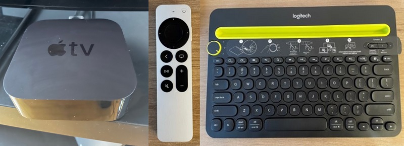
A small, square Apple TV console next to an Apple TV remote with a track pad and an Bluetooth keyboard.
Apple TV console, remote with track pad and Bluetooth keyboard

Apple TV findings
  • Profile buttons do not have accessible names or roles that distinguish them.
  • Notifications when a show is added or removed to or from a list are not announced.
  • Carousels lack names.
RuleStatus
1. Controls have accessible names/rolesFail
2. Focus indicator on interactive controlsPass
3. Support multiple input modesPass
4. Announce notificationsFail
5. Focus managementPass
6. Control groups have namesFail
7. Groups announce number of itemsPass
8. Text color contrastFail
9. Support zooming/resizing textPass
10. Allow both screen orientationsN/A

Android phone

Screen reader: TalkBack on Android OS

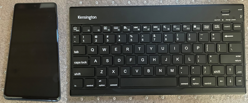
A smartphone next to a Bluetooth keyboard
Samsung Galaxy S20 and a Bluetooth keyboard
Android findings
  • “Add to My List” and “Remove from My List” controls are missing the button role and accessible names.
  • Episode selector does not announce the number of items in the control, the button role or selected state.
  • Most player controls do not have proper accessible names and roles.
RuleStatus
1. Controls have accessible names/rolesFail
2. Focus indicator on interactive controlsPass
3. Support multiple input modesPass
4. Announce notificationsPass
5. Focus managementPass
6. Control groups have namesFail
7. Groups announce number of itemsFail
8. Text color contrastFail
9. Support zooming/resizing textPass
10. Allow both screen orientationsFail

Fire TV

Screen reader: VoiceView on Fire OS

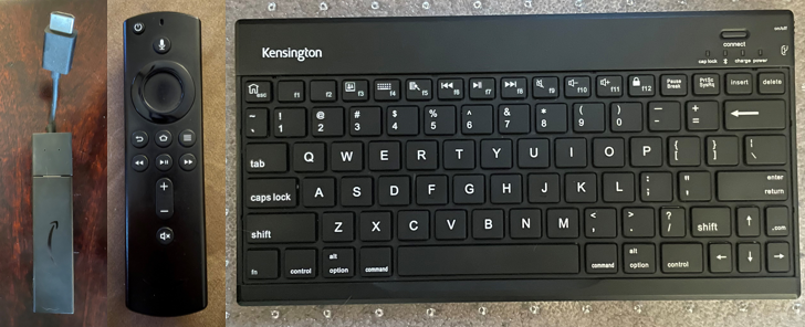
Fire TV stick and remote next to a Bluetooth keyboard
Fire TV stick and remote with a Bluetooth keyboard

Fire TV findings
  • Profile buttons do not have accessible names that distinguish them.
  • Tabbed navigation and carousels do not announce the number of items in the group. Episodes announce n of -1.
  • Shows do not announce their titles which are displayed as images.
RuleStatus
1. Controls have accessible names/rolesFail
2. Focus indicator on interactive controlsPass
3. Support multiple input modesPass
4. Announce notificationsPass
5. Focus managementPass
6. Control groups have namesPass
7. Groups announce number of itemsFail
8. Text color contrastFail
9. Support zooming/resizing textPass
10. Allow both screen orientationsN/A

Samsung TV

Screen reader: Voice Guide on Tizen

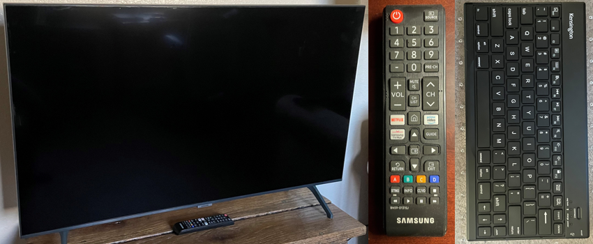
Samsung 42" TV and remote next to a Bluetooth keyboard
Samsung TV and remote with a Bluetooth keyboard

Samsung TV findings
  • Sign In form does not provide audible feedback for input typed with a Bluetooth keyboard.
  • Low color contrast between text and background images.
  • Episodes don’t announce the episode number.
RuleStatus
1. Controls have accessible names/rolesPass
2. Focus indicator on interactive controlsPass
3. Support multiple input modesPass
4. Announce notificationsPass
5. Focus managementPass
6. Control groups have namesPass
7. Groups announce number of itemsPass
8. Text color contrastFail
9. Support zooming/resizing textFail
10. Allow both screen orientationsN/A

Xbox

Screen reader: Narrator on Xbox software system

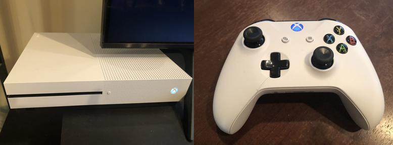
White Xbox console and controller
Xbox console and controller

Xbox findings
  • Content is grouped, group label is announced, Tabbed navigation announces the number of items in the group, for example 3 of 10.
  • Visual notifications are not announced.
  • Regular text does not have sufficient contrast with its background.
RuleStatus
1. Controls have accessible names/rolesPass
2. Focus indicator on interactive controlsPass
3. Support multiple input modesPass
4. Announce notificationsFail
5. Focus managementPass
6. Control groups have namesPass
7. Groups announce number of itemsPass
8. Text color contrastFail
9. Support zooming/resizing textPass
10. Allow both screen orientationsN/A

Overall findings

Every platform tested had issues, with Samsung TV and Xbox having the most accessibility support and Apple TV and Android having the least.

RuleApple TVAndroidFire TVSamsungXbox
1. Controls have accessible names/rolesFailFailFailPassPass
2. Focus indicator on interactive controlsPassPassPassPassPass
3. Support multiple input modesPassPassPassPassPass
4. Announce notificationsFailPassPassPassFail
5. Focus managementPassPassPassPassPass
6. Control groups have namesFailFailPassPassPass
7. Groups announce number of itemsPassFailFailPassPass
8. Text color contrast FailFailFailFailFail
9. Support zooming/resizing textPassPassPassFailPass
10. Allow both screen orientationsN/AFailN/AN/AN/A

Conclusion

This article represents data for a single app only and we encourage the community to research other applications across additional platforms and devices to add to the body of knowledge. Our goal was to surface specific accessibility issues that have a critical impact on a user’s ability to navigate the journey from signing in to watching a show. We hope this creates visibility and awareness of the effects from not testing for, and fixing, accessibility issues in streaming video applications and helps inform the pool of best practices for inclusive streaming experiences.

Structuring accessible forms

Last updated: 27 January 2023

Forms have a strong semantic structure from labeling controls to ensuring the states of controls are announced by assistive technology. We look at the basics of building a form with different input types, adding in the necessary HTML attributes to link our form elements semantically, sprinkling in ARIA attributes and data validation and errors.

Below is the Code Pen for my accessible form example. Access the code in the GitHub repository.

See the Pen Accessible Forms by Rachele (@racheleditullio) on CodePen.

Creating our form fields

The two basic parts of a form field are its <label> and <input> elements. We semantically link the two by

  • Using the <label for="uniqueID"> attribute which matches the <input id="uniqueID"> attribute; or
  • Making the <input> element a child of the <label> element

Doing so allows screens readers to announce the field’s <label> when the <input> gets focus. It also enables the <label> as an additional hit area when using the mouse to focus on an <input>, which is especially useful for checkboxes and radio buttons.

We also need to specify the type of input using the <input type=""> attribute. Putting those together, we have a basic form with one text field and two radio buttons.

<form>
  <label for="name">Cat's name</label>
  <input type="text" id="name" name="name">

  <label><input type="radio" id="yes"> Yes</label>
  <label><input type="radio" id="no"> No</label>

  <button type="submit">Send</button>
</form>

A note on comboboxes

As much as possible, use native HTML <select> and <option> elements to create an expandable list of single-select options.

...
<label for="markings">Cat's markings</label>
<select name="markings" id="markings">
  <option value=""> select an option </option>
  <option value="solid">Solid</option>
  <option value="bi">Bi-color</option>
  ...
</select>
...

autocomplete attribute

Part of structuring an accessible form is providing information about the type of data required by the field and providing autocomplete options if available. We do this by adding the autocomplete attribute to form fields asking for personal information.

<input type="email" id="email" name="email" autocomplete="email">

Below are some common examples of fields asking for personal information and their autocomplete values. Reference the full list of autocomplete values.

  • First name: given-name
  • Last name: family-name
  • Email: email
  • Username: username
  • Company: organization
  • Zip code: postal-code

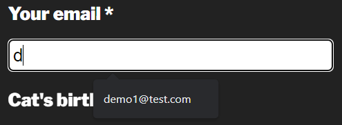
If autocomplete information is available in the browser, fields with the autocomplete attributes will offer suggestions.

Autocomplete suggestion for an email field in Chrome

Grouping similar fields

Our radio buttons are labeled ‘yes’ and ‘no,’ but what are they for? We need to use the <fieldset> and <legend> elements to provide that semantic meaning. The <fieldset> groups the related form fields while the <legend> provides a name for the grouping. These are most often used for checkboxes and radio buttons but they can be useful for grouping other related fields, e.g. Shipping address.

Since radio button options may have similar names, group like radio buttons with the name="groupName" attribute. Keyboard users move between radio buttons in a group with the arrow keys.

...
<fieldset>
  <legend>Is your cat altered?</legend>
    <label><input type="radio" name="altered" id="yes"> Yes</label>
    <label><input type="radio" name="altered" id="no"> No</label>
</fieldset>
...

Marking required fields

Provide a visible indication of the required fields for sighted users, such as an asterisk. Include text before the form indicating how users can recognize required fields. See Kitty Giraudel’s article The required fault in our stars for a discussion on ways to denote required fields. Research from Baymard suggests e-commerce sites need to mark both required and optional fields.

Then there are two attributes we can use to programmatically define required fields: aria-required="true" and required. Use one (not both) of these attributes to ensure required fields are conveyed appropriately to assistive technology. Screen readers will say required when announcing the form field name, role and state.

...
<label for="name">Cat's name*</label>
<input type="text" id="name" name="name" required>

<label for="email">Your email*</label>
<input type="email" id="email" name="email" autocomplete="email" aria-required="true">
...

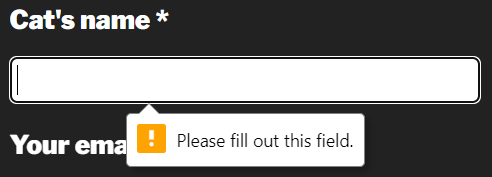
The required attribute provides a first layer of form validation on submit. Many modern browsers will not submit a form with empty required fields and will even provide a visible error message.

Required field in Chrome

However, user agent error handling is not dependable as these error messages are not always announced or available to assistive technology; they can’t be styled or resized; and they are not persistent. To disable browser validation testing, include the novalidate attribute in the <form> element.

Verifying data

In addition to marking fields as required for assistive technology, we also have to indicate if the data entered into each field is valid. All required fields should also include the aria-invalid="true" attribute added with JavaScript once the form has been submitted. Remove this attribute once valid data is entered.

We can further enforce data validation in HTML for fields that aren’t necessarily required by using the pattern attribute that accepts a regular expression. Let’s create a field for collecting birthday with a required format of mm/dd/yyyy.

...
<input type="text" id="birthday" name="birthday" pattern="^\s*(1[012]|0?[1-9])\/(3[01]|[12][0-9]|0?[1-9])\/((?:19|20)\d{2})\s*$" aria-describedby="error4">
<p id="error4">Birthday format mm/dd/yyyy</p>
...

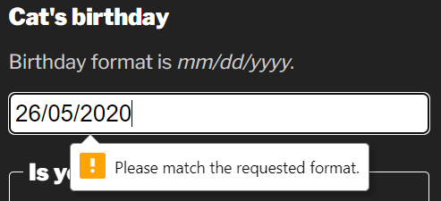
This pattern matching prevents the form from submitting if the data entered does not match the specified pattern.

A form field that fails pattern validation in Chrome

Ensure users of assistive technology are aware of the required pattern by programmatically linking the help text with the form field using the aria-describedby attribute.

inputmode attribute

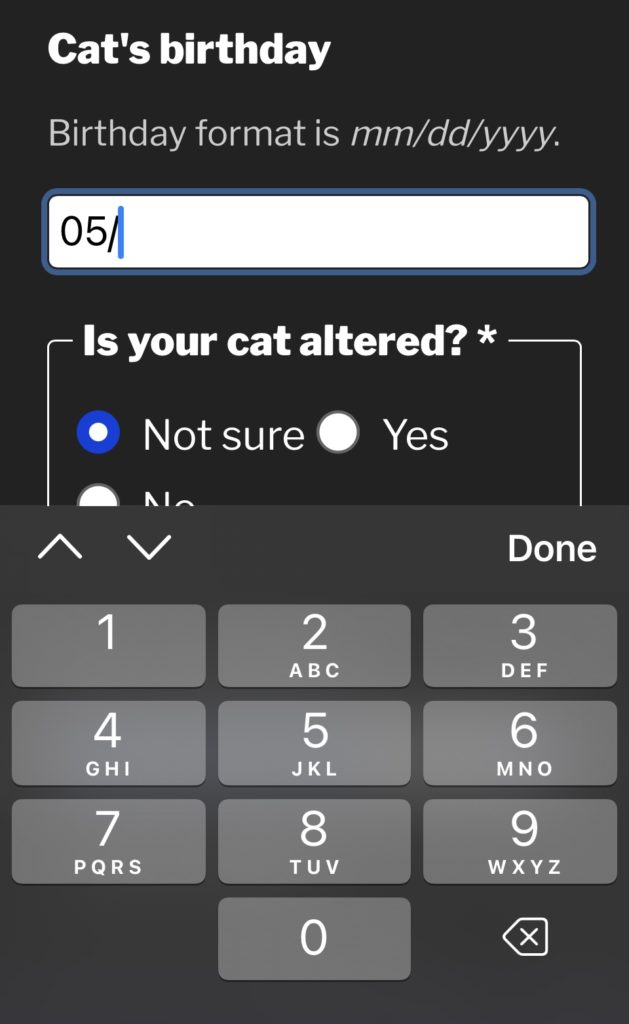
We can make it easier for people entering the date into the form field on mobile devices by adding the inputmode attribute. This attribute allows us to specify which virtual keyboard is displayed in supported browsers. Since dates are numeric, we can use inputmode="numeric" to display the numbers keyboard which provides fewer options and larger hit areas for each key.

screen shot of a mobile website form with the cursor in a field called Cat's birthday while the numeric virtual keyboard displays below.
Numeric virtual keyboard on iOS

Note: In my demo, I use JavaScript to add the slash characters to the date automatically as the slash character is not available on the numeric virtual keyboard.

Handling errors

It’s important to provide a list of all errors at the top of the form or provide them in-context of the field in error. We can programmatically link the error message with the form field using the aria-describedby attribute. This is only necessary when an error message provides information that helps the user enter the correct data.

...
<input type="email" id="email" name="email" autocomplete="email" aria-required="true" aria-describedby="error-email">
<p id="error-email">Email format email@domain.com</p>
...

When assistive technology users focus on the email field, the error message is announced along with the name, role and state of the field.

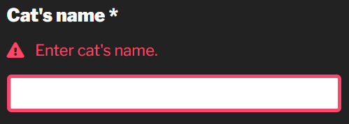
Error messages must be visible, persistent and close to the field in error. Don’t rely on color alone to convey errors. Include an icon with “error” as the text. Move focus to the error messages at the top of the form or to the first field in error on form submit.

A form field in error using JavaScript validation

Conclusion

I hope you found something to make your forms more accessible. I like forms because they have such a strong semantic structure. There are a lot of things to get right but it’s pretty straightforward what “right” means in this context: Make sure anything that is conveyed visually is also conveyed to assistive technology, including the states of form fields.

Disability Independence Day

The Disability Rights Movement in the United States is a difficult and ongoing fight. From inaccessible buses and buildings to today’s inaccessible websites, the disability community has a long legacy of protesting for equal access. On March 12, 1990, more than 1,000 disabled people gathered at the US Capitol building in Washington, DC, to advocate for the Americans with Disabilities Act (ADA).

The path to reach the members of the House, where ADA legislation had stalled, was up 83 stone steps. For dozens of people with mobility impairments, this stairway exemplified the never-ending barriers that cause disability. Under the social model of disability, when people have to navigate an environment filled not only with physical barriers but social and communication barriers that limit access, this results in disability.

In a bold display, more than 60 activists left their wheelchairs and mobility devices and began making their way up those 83 stone steps; it became known as the Capitol Crawl.

A disabled man on his knees and a disabled woman scooting ascend the US Capitol steps.
Members of ADAPT during the Capitol Crawl / Photo credit: Tom Olin

The sight of people literally dragging themselves up stairs to demand equal accommodation left an indelible image on the US public and lawmakers. The Capitol Crawl is credited with being the most influential event to lead to the signing of the ADA on July 26, 1990. Today, we celebrate this landmark piece of legislation as Disability Independence Day.

Accommodations—like curb cuts, ramps and elevators—that make the environment easier for all people to navigate daily life are just some of what the ADA promises. As digital creators, we have a responsibility to extend these rights online when people use websites, kiosks and mobile applications. Since the Web was not around in 1990, it is not mentioned in the ADA, but many accessibility lawsuits have ruled that Title III of the ADA applies to digital commerce. If you want your product to be innovative and inclusive, design with disabled people in mind.