How to give your Yammer image uploads alternative text descriptions

At work, we use Microsoft’s social media tool Yammer. It wasn’t clear to me how to give alt text to uploaded images, so I searched through the Yammer support documentation and found a page on accessibility in Yammer. But neither that page nor a supplemental page on using a screen reader with Yammer mentions alt text or images.

screenshot of my Yammer feed with an uploaded image

Looking at the HTML code in my feed, I saw that images are marked up as background images on <figure> elements and contain default descriptions as <figcaption> elements.

<figure style="background-image: url('https://www.yammer.com/image-file-path/preview');">
<figcaption>Attached image: No description set. Image-File-Name.jpg Click to open full-page preview.</figcaption>
</figure>

When you click on an image in your feed, it opens in a modal overlay and displays the image as an <img> element which does have an alt attribute with similar default text.

<img src="image-file-path" alt="Uploaded image: No description set. IMAGE-FILE-NAME.jpg">

In both instances, the default text shows No description set.

Usually, alternative text would not include the image file name. I think Yammer does this because it is also a file sharing tool and in that context, knowing the file name could be useful.

Add a description when attaching an image to a post

Like Twitter and Facebook, Yammer offers the ability to provide an image description when attaching a file to a new post. This option is so hidden, though, that I never noticed it and assumed for a long time it wasn’t possible! I messaged the Microsoft Accessibility team to ask when Yammer would support alt text for user-posted images and got this response:

Thanks for reaching out. When you upload an image to post in Yammer, there is some helptext below the image prompting you to add a description. Please let us know if that’s not what you’re looking for.

@MSFTEnable on Twitter

Sure enough, after the image uploads, there is a tiny line of text beneath the file name that you can click on to enter an image description. It reads:

File attached. Before you post, add a description to this file so it’s accessible to everyone.
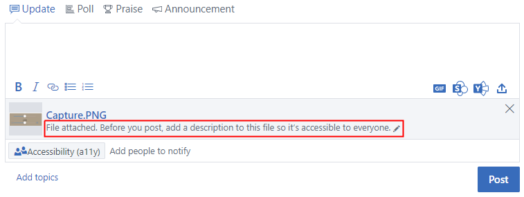
screenshot of an image attachment on a Yammer post with the input field to add an image description highlighted

Tip: End your description with a period so that screen readers pause before announcing the file name.

Add a description to any previously uploaded image

  1. If you’ve already uploaded your image, click it to see the full-page preview screen
  2. At the bottom right of the screen, click the Go to File link
  3. On the file details page, there is an input field that reads “This file doesn’t have a description yet, click here to add one”.

    Click the input field, enter your image description, then click outside of the field to save it.
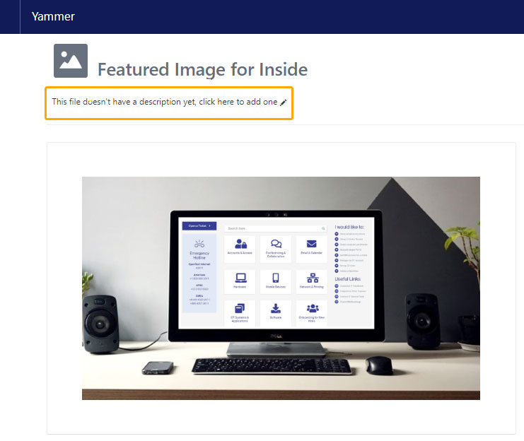
screenshot of the Yammer image details page with a highlight around the input field to add an image description

From my testing, I’m able to add and edit descriptions for images uploaded by other users too, even if I don’t follow them or belong to the group where the file is posted.

YNAB addresses color accessibility

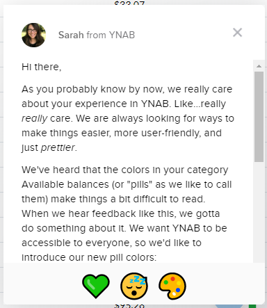
In a recent product update YNAB (You Need a Budget) announced it had made some change to the way it uses color to convey meaning about budget amounts. When I logged into the online webapp today, I saw this modal message dialog. (The content of the announcement is below the image.)

screen shot of a modal announcement dialog in the YNAB web application

Sarah from YNAB

Hi there,

As you probably know by now, we really care about your experience in YNAB. Like…really really care. We are always looking for ways to make things easier, more user-friendly, and just prettier.

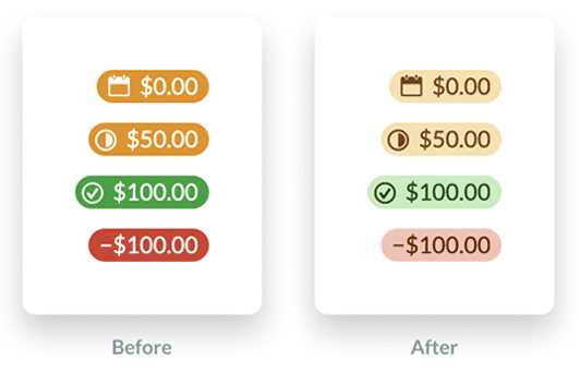
We’ve heard that the colors in your category Available balances (or “pills” as we like to call them) make things a bit difficult to read. When we hear feedback like this, we gotta do something about it. We want YNAB to be accessible to everyone, so we’d like to introduce our new pill colors:

screen shot showing the before and after colors used by YNAB to show budget category information. the before colors are orange, green and red with white text. the after colors are lighter shades of the same colors but with text now a darker shade of each, which has better contrast.

In case you’re wondering, green still means green. Yellow still means yellow. Red still means – you guessed it – red! The only thing that’s changing is the increased contrast, which makes things a bit easier on the eyes.

The message links off to a blog post that discusses the changes further: A Budget That’s Easy On The Eyes

YNAB took note of two accessibility issues

  1. Previously, it used color only to convey the meaning of a budget amount which does not meet success criteria 1.4.1 (level A) Use of Color.

    “We added visual signals to the Available amounts to make it clear whether there was credit overspending or an underfunded goal. We also increased the size of the negative sign for overspent categories. Both of these changes help users with visual impairments easily scan their budget by relying less on a color-based signal.”

  2. The color combinations of white text on an orange background (2.54) and white text on a green background (3.31) failed the color contrast requirement of 4.5:1 for success criteria 1.4.3 (level AA) Contrast (minimum).

    “We significantly increased the contrast between the color of the background (the ‘pill’) and the text, while muting the background color. These changes increase the contrast in general, which makes the text easier to read for everyone.”

The new color combinations do indeed satisfy color contrast requirements now.

YNAB budget colors
Amount typeFG colorBG colorContrast ratio
Negative #651c0b#f7c1b57.68
Positive#1d4913#c4ecbb7.97
Upcoming#70460b#f9e1a96.37

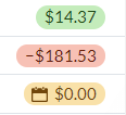
This is a screen shot of how the colors actually look when viewed in the YNAB application. Note that I don’t see a check mark icon next to the positive amount:

screen shot from the YNAB app.

YNAB acknowledges that it is still problematic for users who experience deuteranopia:

While this helps with readability, we still use red and green to send signals about Available amounts, which isn’t the ideal experience for anyone with red-green color blindness.

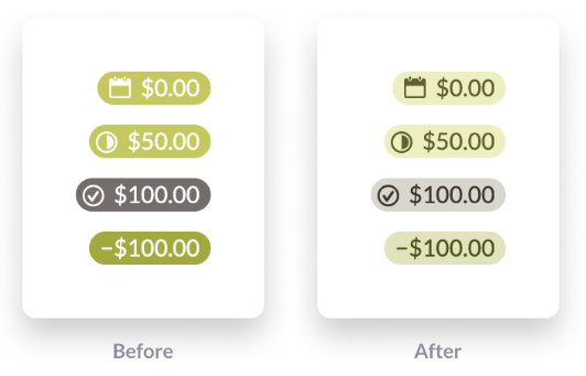
Below is an example of what these colors might look like for these users. It’s actually the difference between the red and orange pills that is nearly imperceptible.

screen shot of the YNAB colors using a filter that simulates red-green color blindness.

It’s great to see more web applications incorporating accessibility. Now if only it were clear what those three icons at the bottom of the modal message window mean. They have aria-label attributes on some emojis that are not at all informative:

<span class="intercom-reaction" aria-label="green heart reaction" aria-pressed="false" role="button" tabindex="0"><span>?</span></span>

<span class="intercom-reaction intercom-reaction-selected" aria-label="sleeping reaction" aria-pressed="true" role="button" tabindex="0"><span>?</span></span>

<span class="intercom-reaction" aria-label="art reaction" aria-pressed="false" role="button" tabindex="0"><span>?</span></span>

Gold’s Gym Class Schedule

Another accessibility challenge! I like trying to use websites with just a keyboard, which rarely works. The Gold’s Gym class schedule page is no exception. It has so many elements that respond to clicks only that it’s basically useless to a keyboard. I’m going to address the three issues that make this page unusable.

  1. Week selector
  2. Day selector
  3. Class information details
screenshot of the class schedule page with multiple areas highlighted

These  examples suffer from the same issues:

  • Mark up that prevents keyboard focus
  • JavaScript that does not include key press functionality

The class schedule defaults to the current week and current day to display information. If you want to look at a different week’s schedule, you have to use the tiny forward and backward arrows next to the week dates.

screenshot showing arrows next to the week April 23, 2018 - April 29, 2018

While each arrow is marked up as <a>, it does not get keyboard focus because there is no href attribute.

<a class="display-table-cell text-left" ng-click="vm.changeWeek(-1)"> <i class="material-icons">chevron_left</i> </a>

I solved that issue by adding tabindex="0"

(That’s the recurring theme for this post!)

However, even though the arrows now gain keyboard focus, they do not respond to key presses. Looking at the code I noticed the ng-click attribute, searched to find that’s AngularJS syntax and found there are others such as ng-keypress. I tried using that via the Chrome inspector but it didn’t work. There’s probably more to it to support key presses.

Each day of the week has a similar issue. Let’s look at the code:

<div class="border border-thin" ng-click="vm.setSelectedDay(day)">...</div>

The days are not marked up as buttons or links so again, no keyboard focus and they use the ng-click attribute only. tabindex="0" to the rescue.

screenshot showing three boxes for days of the week Monday April 23, Tuesday April 24, and Wednesday April 25

The last major issue is accessing the details of a class. For a mouse user, clicking a class opens a modal window. (Once on the modal window, keyboard tabbing resumes on the parent page but that’s another issue.)

screenshot of a modal window with close button and class details

For keyboard users, at this point you’re skipped from the “All instructors” select box, passed all the class details, to a form at the bottom of the page.

The whole class details area is marked up as a table. For a mouse user, an entire table row is a hotspot, not just the word Details.

<tr ng-repeat="scheduledClass in vm.filteredSchedules" ng-click="vm.openClassModal(scheduledClass)" class="ng-scope">...</tr>

tabindex="0" to the rescue.

All of these could benefit from using the :focus pseudo class to emulate the hover states for better visibility of what’s in focus.

screenshot of a row from the classes table showing the first row highlighted and in focus

With just a few tweaks, this page would be far more accessible.