Flipboard Accessibility Audit

I’ve never used Flipboard, so I decided to make my first visit an opportunity for a preliminary accessibility audit based on the WAI Easy Checks – A First Review of Web Accessibility heuristics.

It was a challenge to get the site’s source code because everything is rendered on the fly with JS. I had to use the Chrome inspector and copy/paste the code into an HTML file for upload to the W3C validation service. (And there is no fallback for users without JS.)

screenshot of a snippet of HTML that shows up when JS is disabled on the Flipboard homepage
JavaScript disabled on Flipboard homepage

The validation service returned many errors, but this audit explains three basic accessibility problems.

1) Images Lack Text Alternatives

So basic yet so overlooked, the home page images don’t have alt attributes. This includes both images that are linked and not linked.

For linked images, lack of alt attributes means a screen reader has no context for the link; it’s like a link without text. For all images without alt text, the screen reader will read the file name, which provides little to no context for the element.

Linked image on Flipboard homepage

This is the rendered HTML for the National Geographic square:

<a class=" splash-tile partner" href="/section/national-geographic-ga7unkc6sb3qhid0?intent=invite"><img class="background-image" src="https://images.nationalgeographic.com/wpf/media-live/photos/000/898/overrides/sheep-grazing-judean-desert_89872_990x742.jpg"><img src="https://cdn.flipboard.com/dev_O/featured/svg/logo_natgeo_dark.svg"></a>

And this is how a screen reader would interpret that HTML:

LinkGraphic slash logo underline natgeo underline dark.svg

Always include the alt attribute in the <img> element. If the image is there for visual design only, include an empty attribute alt="". For images that provide contextual information to sighted users, provide meaningful descriptions of the contents.

Flipboard.com also uses a lot of SVG, none which is accessible because there are no <title> or <desc> elements used to provide text alternatives for these graphics. For example, the Flipboard logo shows up as an empty link. SitePoint has a great article on how to create accessible SVG.

2) Form Fields Lack Labels

The sign up form on the homepage relies on placeholder text to do the job of field labels. The problem with this approach is that labels provide context for form fields that placeholder text can’t. Further the poor color contrast with the light gray text on a white background does not meet accessibility standards with a ratio of 2.28:1.
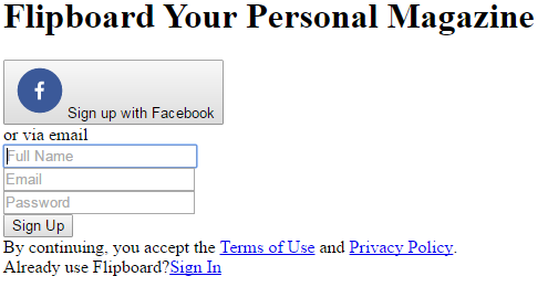
HTML for the sign up form with CSS disabled to show it does not have form labels

Labels don’t have to be visible, accessible by screen-readers only, but relying on placeholder text makes it difficult for users to remember what data to enter after they start typing; this is probably not a big deal for a three field form, but it’s a good idea to be consistent. This form could change the placeholder text into field labels while maintaining the same visual design.
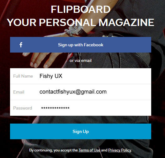
screenshot of the sign up form with field labels always visible


This form does deserve some props for using a “Full Name” field instead of two fields for first name and last name, and for not having a “Confirm Password” field.

3) Poor Keyboard Access and Visual Focus

Many people cannot use a mouse (or finger) to navigate websites and rely on keyboards or assistive technologies to move between links. For this to work, links must

  • provide sufficient visual queues when they are in focus, and
  • be a logical order within the source code that closely matches the natural reading order

The simple litmus test for this is to try to tab through a site. I had a lot of trouble with Flipboard because none of the links had visual focus. For example, the “Sign In” link in the upper right changes background color on hover, but not on focus; so when users tab to this link, there is no visual indication of where they are on the page.

screenshot showing the sign in link box


Further, the “Sign In” link looks like it’s the first or second link on the page, but it’s actually the 12th link, requiring users to tab through the sign up form before they can sign in to use the site. That link needs to move up in the source code to be more readily accessible.

Some content is hidden from some users

Looking at the homepage with CSS disabled, I noticed two things that cannot be reached by everyone: a search box and a “Sign In” option that opens a modal window.

screenshot showing that the sign in link and search box are not visible when CSS is enabled

All content must be accessible to all users. While users can tab to the search box, it remains invisible on focus to keyboard-only user and it lacks both a field label and a form submit button. Ironically, search appears to be more accessible to screen readers than to visual users because I didn’t see search on the page.

The “Sign In” option functions as a link but is not marked up as a link.

<div role="button" class="tab-item login-button" data-
reactid=".0.$/.0.2.3:$signintabitem">Sign In</div>

Because it is not an <a>, users cannot tab to this element; it’s not really a link. I see this all the time, and there are several more examples on the Flipboard homepage. In my experience, this is lazy coding in a JS framework.

Recommendations

These three issues are just the beginning. The site does not make use of ARIA role attributes for navigation, proper headings for the document outline, or pass a logical structure check of the HTML. Flipboard needs to work with an accessibility expert to make its site inclusive. This web accessibility checklist is a good place to start.

Image Descriptions Finally Possible for Desktop Tweets

In March, Twitter enabled users of its mobile apps the option to add a text description (alt text) when tweeting images. Last week, the Twitter A11y Team announced this functionality is available to users of its desktop website too.

screenshot of the Twitter a11y tweet announcing desktop support for image descriptions, alt tags

To enable this feature, go to the Profile > Settings > Accessibility screen using the desktop version of twitter.com. Check the box for “Compose image descriptions,” then click the ‘Save Changes’ button.

Screenshot of the Twitter accessibility screen

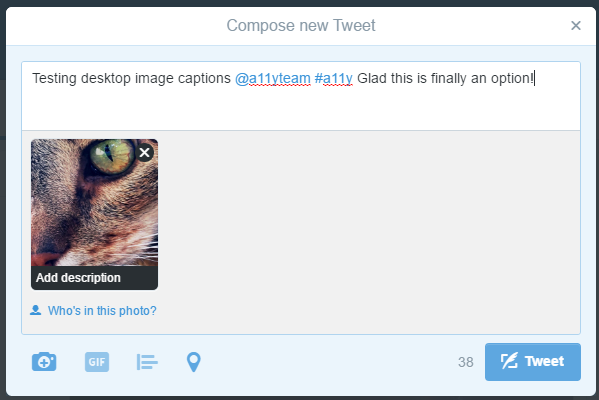
You’re all set! The next time you insert an image into a tweet, you’ll have the option to compose a description, which will be added as alt text for screen readers.

Click the ‘Add description’ option at the bottom of the attached image.

Screenshot of a new twitter dialog box with the option to add an image description

Type a useful image description into the form field and click ‘Apply.’

screenshot of the image description screen for an image attached to a tweet

Here’s the image description as alt tag in the HTML.

<img data-aria-label-part="" src="https://pbs.twimg.com/media/CjzeFsQVEAAOQyk.jpg" alt="close up of a tabby cat's face" style="width: 100%; top: -84px;">

If an image is not given a text description, an empty alt attribute is used instead.

5 Ways Buying Alamo Drafthouse Tickets Online Fails

The Austin-based Alamo Drafthouse movie theater chain has moved to assigned seating and the ability to reserve tickets through online ordering. I went through this process for the first time over the weekend and ran into several usability problems.

1) Field types are not marked

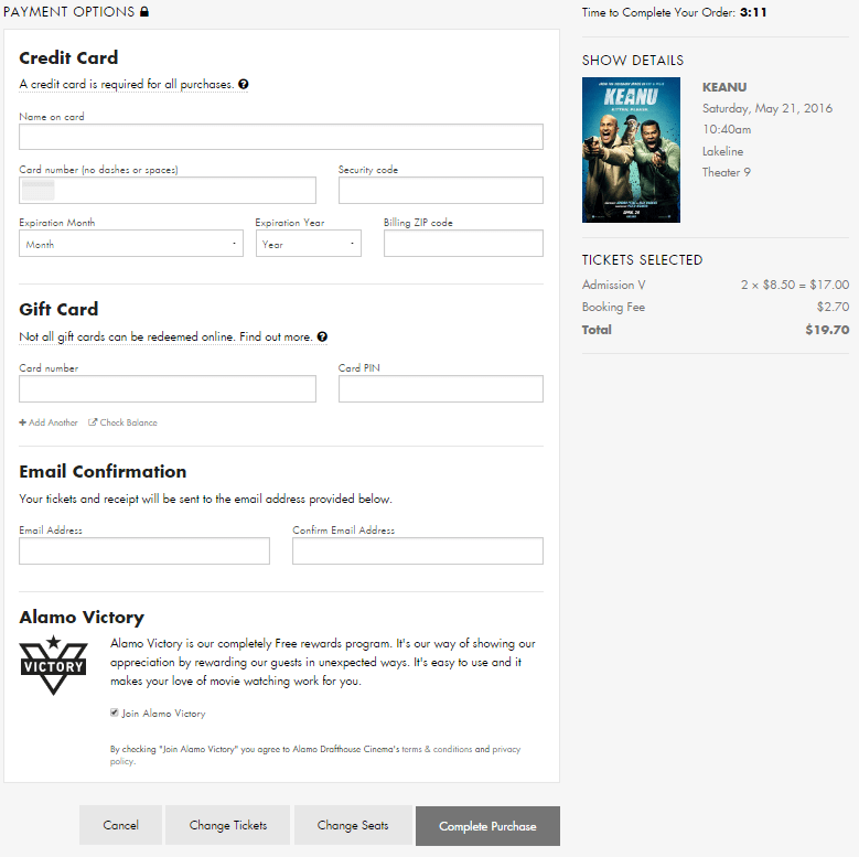
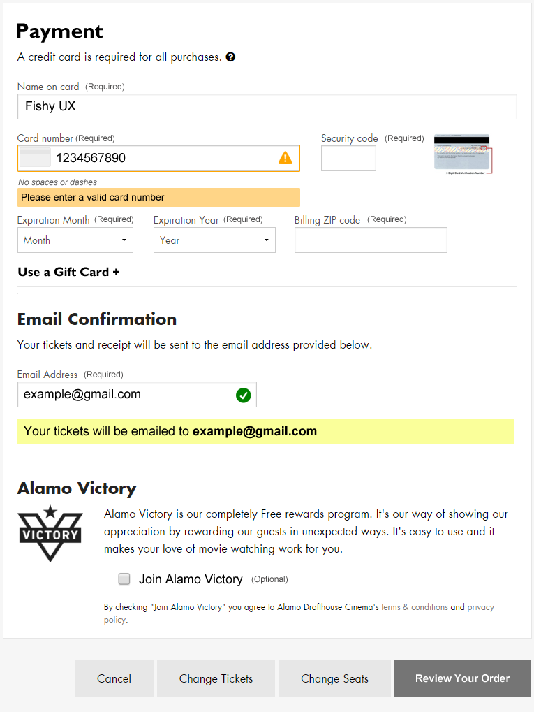
screenshot of an online form for reserving movie tickets
Screenshot of the Alamo Drafthouse online ticket form

This one is so basic. I’ve done enough online ordering that I assumed the payment fields are all required, but that’s not a given for every user.

In the “Email Confirmation” section it’s unclear that an email address is required for making a purchase. It looks like an optional choice as I have no reason to believe I won’t get access to my tickets immediately after paying, but failing to enter a valid email address in two different fields results in an error after submitting the form.

Recent e-commerce research suggests that marking all fields, required or optional, improves the customer experience.

2) Poor error messaging

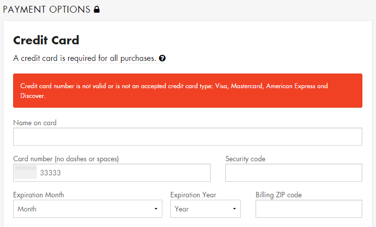
There is no immediate feedback when a user enters invalid data. I typed in my credit card number incorrectly and only after trying to complete the purchase did an error message display. However, the error was located at the top of the form, out of sight, as I sat there frustrated and wondering what was taking so long.

screenshot of a form error message reading credit card number is not valid or is not an accepted card type
Screenshot of form error message

Eventually I scrolled up the page and saw the error message, but it didn’t indicate which field was in error by either putting the error in context of the field or by making the text of the error specific to the data issue.

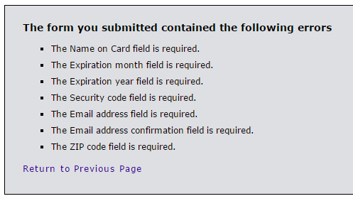
After entering a valid credit card number, I tried submitting the form without entering anything into the other fields as a test. This took me to a new page, devoid of any branding information for the site, displaying a laundry list of what I did wrong.

screenshot of an error message page indicating all the fields that are required
Screenshot of the error message page

Taking a user to a page like this immediately throws up a red flag. Am I still on the right site? What’s going on? Did my credit card number just get stolen?

If an entered value contains an error, ideally do inline validation or at least display that error message in-context of the form, next to the field with the error.

Further testing showed that if the form is submitted with a valid credit card number but invalid security code, expiration date, zip code, etc., the form returns a blank page with a “card declined” error message and no way to return to the form and fix the issues. The transaction is simply cancelled without even a link back to the page where the transaction started.

There was an error with your order. Your card was declined. Your order has been cancelled and you will not be charged.

Hitting the back button provides yet another frustrating error and no way to continue with a purchase.

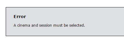
Error. A cinema and session must be selected.

3) Confusing payment button

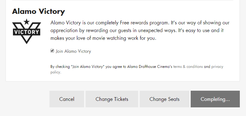
The way the form submission button functions also contributed to failure. It reads “Complete Purchase” before clicking it, but after clicking it, it changes to “Completing…”

Field buttons labeled cancel, change tickets, change seats, completing...
Screenshot of form buttons

Because I had entered an invalid credit card number, my purchase wasn’t completing at all, but I sat there waiting… This button should probably be a “Review Order” button that completes all field validation. Then, the user can “Complete Purchase” from a verification screen.

4) No way to continue after timeout

If you take longer than five minutes to complete your purchase, it times out and you see another useless error message.

Your order has expired. Sorry but your order has timed out and has been cancelled. You will need to restart the process. Return to Home page.

I don’t know who or how they decided to set the timer at five minutes, but I timed out because of the credit card number error message issues. Maybe they did some usability testing and five minutes is enough for most users, but for those of us who timeout, this experience should be friendly and helpful.

The goal is to sell tickets, yet this message gives the impression that the Alamo Drafthouse doesn’t care if you had trouble with the process of online ticket buying, or about helping you try again.

At the bare minimum, this message needs to be smart enough to display the theater, movie and show time you were trying to purchase tickets for and provide a link back to the start of the purchase process.

5) Optional checkbox already checked

The last section titled “Alamo Victory” takes up about 25% of the page real estate with a boring marketing blurb and an almost hidden pre-checked option for ‘Join Alamo Victory’. My favorite part is the disclaimer after it:

By checking “Join Alamo Victory” you agree to the Alamo Drafthouse Cinema’s terms & conditions and privacy policy.

screenshot of the Alamo Victory section

Oh really? Cuz I didn’t check that box, Alamo Drafthouse checked it for me. This is the same annoying tactic of pre-checking a “sign up for our spam emails” box on other purchases. Just don’t. Always allow me to decide if I want to join extra programs.

Design Recommendations

The online ticket purchase process needs a lot of help. I think Alamo Drafthouse decision makers would be surprised how much customers struggle with this website site if they would sit and watch some usability testing.

  1. Mark all fields as either required or optional
  2. Do inline form field validation/improve error messages
  3. Change the “Complete Purchase” button to “Review Order” so that all field inputs are validated first
  4. Provide users a way to retry a transaction that times out
  5. Remove the check from the optional field
Screenshot of recommended form updates