Three years later, iTunes still sucks

Last month, writer Amy X. Wang wrote a spot-on article outlining many of the issues that still plague iTunes even 13 years after it first launched.

I have avoided using iTunes at all, and only when necessary to sync or do a backup to my computer instead of iCloud. It’s been at least three years since I had it installed but I needed to do a backup and manual sync for some files after porting over to a new mobile provider.

Reluctantly, I installed iTunes 12 on my work computer. And sure enough, it still sucks due to extreme slowness and confusing IA. Per instructions from IT, I couldn’t do a restore from the backup though. It took aimless clicking around to locate my apps.

screenshot of the iTunes 12 interface showing the apps area
Screenshot: iTunes 12 apps

I had to figure out the link to the Apps area is hidden in the upper leftmenu. Then after much frustration, I saw that I needed to click a buried link labeled “Purchased” to access apps I’ve installed before. (I have never understood labeling all apps as ‘purchased’ when I’ve paid for all of five apps.)

After landing on my page of apps, which apparently shows any app I ever installed and not just the ones I currently use, I again found myself stuck. Hovering over the app icons and right-clicking didn’t provide any options or tool tips.

screenshot of the iTunes purchased apps with icons for each app
Screenshot: iTunes purchased apps

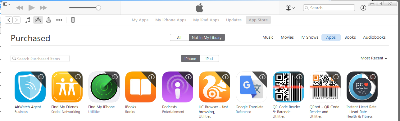
There’s a little cloud icon with a down arrow over each app icon, so I clicked one and nothing apparent happened. I tried again; I tried others; no obvious feedback. Then after clicking one, I saw a flash at the top of the screen.

screenshot showing the app downloading message at the top
Screenshot: iTunes app download message

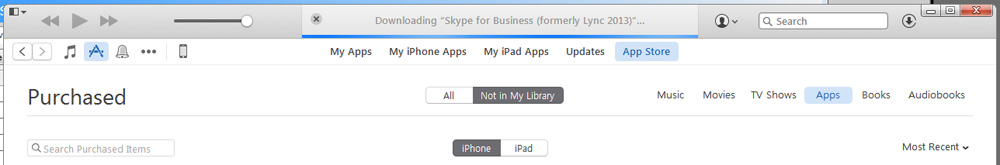
I finally got this screen shot with some quick print screen work. While studying the image, I noticed another icon in the upper right, a circle with a down arrow. Clicking on that, I could see a list of apps I had queued for download. Only, nothing was happening. Also, why do the apps have to download to my computer for me to sync them?

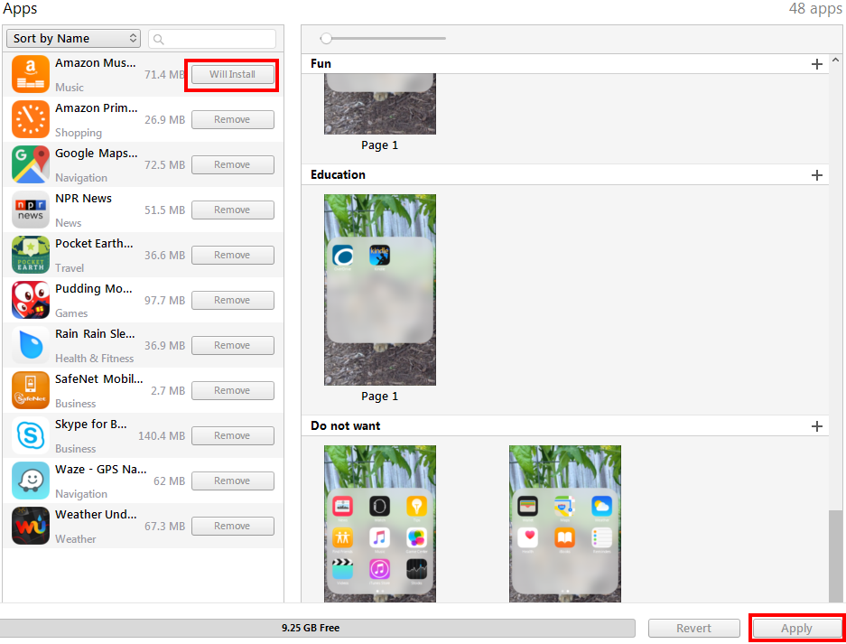
I went over to the phone sync screen and saw a few of the apps I had apparently downloaded, and attempted to install them. I didn’t noticed for some time, though, that after choosing to install an app, I had to click another button hidden in the lower right.

screenshot of the iTunes phone sync apps where you install or remove apps
Screenshot: iTunes phone apps

Eventually I gave up. I went into the App Store on my new phone, found the “Purchased” apps area, and was able to quickly download the apps I wanted to use. The only thing I have to use iTunes for is creating custom ringtones. I’ve never purchased music or any other content from the iTunes store (preferring Amazon Music) and will continue to resist the Apple ecosystem.

screenshot of the iPhone App Store with icons and options to download previously installed apps
Screenshot: iPhone App Store purchased apps

Registering a Product Shouldn’t be this Hard

When I bought a new dishwasher recently, I went online to register it with Frigidaire in case I needed to use the warranty. My immediate reaction was, is this something I have to print out and mail in?

screenshot of a web form on the Frigidaire website
Screenshot: Frigidaire product registration form

This form suffers from a lot of problems including

  • Unclear form fields because they aren’t boxes, just underlines; where do I click?
  • Unnecessary fields (email confirmation, first and last name instead of full name)
  • Small text with poor contrast
  • Required fields that aren’t marked (address, city, state, zip)

My focus for this post, though, is the next part of the form where the user is asked to enter product information.

screenshot of form requiring the user to click a box to show the form's fields
Screenshot: Add a product

The whole reason I’m filling out this form is to add product information, yet those fields are obfuscated by an unnecessary ‘add product information’ link. When clicked, fields for model number, serial number, date of purchase and location of purchase display, and the wonky ‘add production information’ link remains.

screenshot of a web form with four fields model number, serial number, date and location with a disabled submit button
Screenshot: Add product fields

If you click the ‘add’ button without filling out these fields, you get error messages for three of the fields as it turns out model number, serial number and purchase date are required.

screenshot of error messages when leaving the add a product fields blank
Screenshot: Add product form validation

Design Recommendations

  1. Don’t require the user to click the ‘add production information’ link to see the form fields and remove the unnecessary help text above the form: “Click below to add your product information”
  2. Clearly indicate required fields
  3. Make form fields look like form fields
  4. Provide form labels and keep formattitng instructions visible instead of using placeholder text
  5. Make it easier for users to understand what model number and serial number are and where to find them

I gave the form a streamlined, top-to-bottom flow with large text and obvious form fields. To the right is an example of a product tag that shows what the user is looking for to locate model and serial numbers; I also listed the links to the help pages that show the locations of these tags for each product type.

screenshot of the form with three fields model number, serial number, purchase date and links to find this information
Redesigned add product form

The form checks the field data as it is entered and alerts the user of errors inline. Once a field’s data validates, a check mark displays next to it. After the user enters his model number, an image of that product and the product’s name display below the field for visual verification.

screenshot of the redesigned add product form will the fields field out
Redesigned form filled out

Once all required fields are verified, the “Done” button becomes active. After clicking “Done”, the user can choose to add additional products—something the existing form handles well.

Hangouts, where’s my mute?

I mostly use Hangouts to communicate with friends and family. While at work on my laptop, I use the Chrome extension for Hangouts. The rest of the time I use the iPhone app. The user experience between these two versions is not the same though, because the navigation menu is so different.

I think the iPhone app has the superior layout and use of space.

screenshot of the Hangouts iPhone app with title at the top and a menu bar with options favorite, voice, invite, video, mute, details
Google Hangouts iPhone app

With one tap of the menu icon, you get access to most of the hangout features, the rest of which are available by tapping the “Details” icon.

Conversely, in the browser extension the same features are either missing or work differently.

screenshot of the extension menu bar with icons for video call, people, and options
Google Hangouts extension chat window

I am most annoyed that the ‘Mute’ function is missing because I use it frequently. It’s located under the ‘Options’ icon, labeled “Notifications”, and is turned on/off with a check box.

screenshot of the Hangouts extension 'Options' screen with edit name, notifications check box, history check box, archive, and leave
Google Hangouts extension ‘Options’ screen


After unchecking the “Notifications” box, you have to click ‘Save’ to return to the chat window. The total interaction requires three clicks, context switching, and a confirmation action. After turning off notifications, though, the menu bar displays an indication icon.

menu bar showing a mute icon for the chat
Hangouts extension notifications off

Clicking the ‘Mute’ icon now performs the same action as clicking the ‘Options’ icon and you have to check the “Notifications” checkbox to turn them back on.

Design Recommendations

  1. Add the ‘Mute’ icon and allow for single click to turn notifications on or off
  2. Use consistent labels—change “Notifications” to “Mute” and “Options” to “Details”

screenshot of extension menu bar design with mute icon added and options icon updated to match the app
Updated menu bar with mute icon

Favorites doesn’t seem to be supported in the extension and it never remembers my favorites in the app, so I don’t see this as missing on the desktop. Not including Voice is questionable, it could open up Google Voice, but using that on desktop is also not something I do. Video hangouts cover both.