This month at work, we’ve started using new time tracking software for submitting our timesheets. The process for submitting a timesheet in this system is a truly cursed design pattern. Behold, the “Submit Timesheet” button.
I tried clicking on the “Submit Timesheet” text and nothing happened. I expected this text to be a button because it’s supposed to submit the timesheet, but no, this is not a button.
I asked myself, “Why is there an error icon?”
Then I hovered the mouse cursor over the error icon and saw this:
It’s not very obvious, but this control looks like a switch. When I inspected the switch, this is what I saw, simplified:
I went to the movies this week for the first time since the pandemic began. I looked up showings at the Alamo Drafthouse and discovered little has improved with their payment process since I reviewed it on desktop back in 2016. This time, I completed the purchase on an iPhone using the responsive mobile website in the Firefox browser.
While I found several accessibility issues with the site, I’m highlighting concerns with the “Payment” screen. I’m neurodivergent and this post focuses on five things that cause me anxiety and make the experience frustrating:
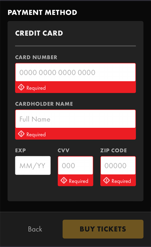
I’ve done enough online ordering that I assumed that all the credit card-related fields are required, but many people will not understand that. E-commerce research suggests that marking all fields, required or optional, improves the customer experience. It certainly lessens my anxiety to know exactly which fields to complete.
Not only are required fields not clearly marked, but merely interacting with a field causes the display of an angry, red “Required” message. (This does not work for the “EXP” field even though it is required.) These input fields use a combination of the HTML required attribute with an aria-describedby attribute for the error message which causes assistive technology to announce fields are required multiple times.
Submit button is disabled
From the previous screenshots, we can see the next issue that causes me a lot of anxiety when using a website. The “Buy Tickets” button, which is the submit button for the form, is disabled by default. The button becomes enabled only after data has been entered into all the required form fields, which are not clearly marked.
There are two more required form fields below the credit card fields but they are easy to miss because of the sticky footer with the “Buy Tickets” button, meaning that after entering all credit card details, this button is still disabled.
Error messages don’t offer suggestions
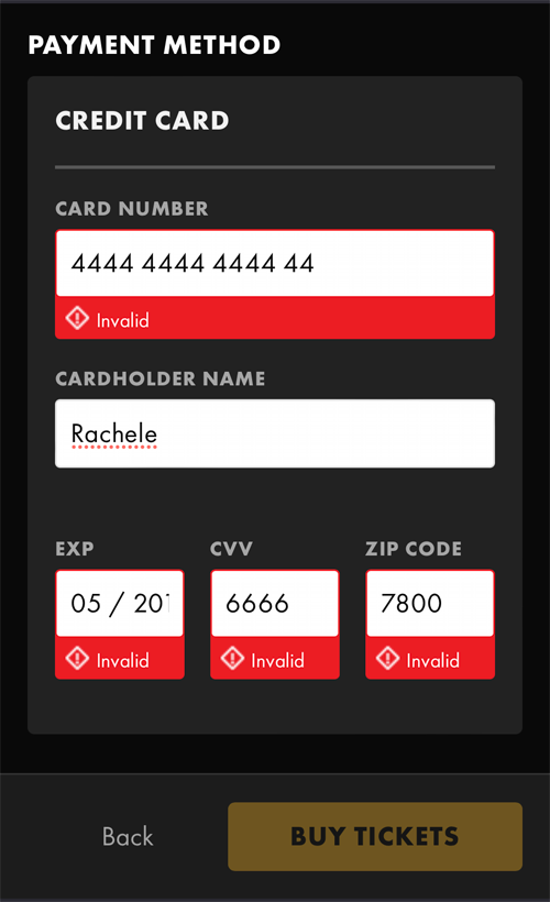
The default error message for empty fields is “Required”. If a user enters data in the wrong format, the error messages change to “Invalid”. This doesn’t help the user in any way to figure out how to fix the error.
Here are some examples of helpful error messages:
Card Number: Please enter 16 digits
EXP: Please enter 2-digit year
CVV: Please enter 3 digits
Zip Code: Please enter 5-digit US zip code
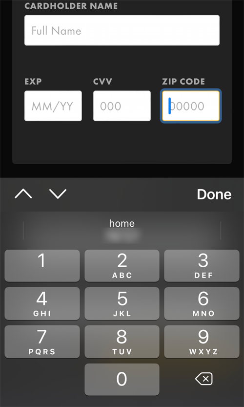
“Zip Code” is the only field requesting numerical data that displays the numerical keyboard on mobile devices. Adding the inputmode="numeric" attribute to every field requesting numerical data will display the numerical keyboard too, which improves the accuracy of data entered into these fields.
Data formats are placeholder text
The requested data format for all the “Payment” screen fields are implemented as placeholder text. This means that once a person starts to enter data into the field, the required formatting of that data disappears. People are forced to recall from memory how to enter the data correctly. On top of this, the “EXP” and “CVV” fields allow someone to enter more digits than the data format allows.
The video below demonstrates what a person using assistive technology, like a screen reader, experiences when exploring the form. Notice how placeholder data are not consistently announced by VoiceOver.
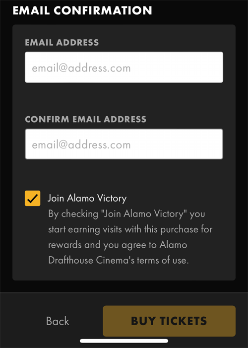
Optional checkbox is already checked
Following the credit card-related fields is the “Email Confirmation” section which includes a checkbox that is already checked:
Join Alamo Victory
By checking “Join Alamo Victory” you start earning visits with this purchase for rewards and you agree to Alamo Drafthouse Cinema’s terms of use.
This is an optional field. It should require that I choose to check it. Because of its location behind the sticky footer, it’s very likely people will not see this checkbox and inadvertently join this program. Having to look for sneaky UI patterns like this makes for a bad experience.
Conclusion
This website has made some improvements like providing a “Back” button after timeout and inline form field validation. I also give the developers kudos for appropriately implementing the autocomplete attribute on the credit card-related fields. I’d make the following changes to the “Payment” screen to create a better experience for neurodivergent people:
Clearly indicate which form fields are required
Don’t disable the submit button
Offer suggestions for fixing data input errors
Display required data formats at all times
Don’t pre-check checkboxes for optional promotions
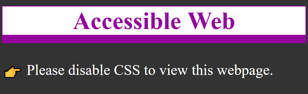
It all started when I built the Accessible Web tool which removes CSS and JS from a webpage, leaving plain HTML. I built it as a sarcastic response to a developer who changed his website to require visitors to disable JavaScript before they could view the content. The reactions to this gatekeeping on Twitter were hilarious! So many angry developers didn’t get the joke that they put up similar barriers when they require that people have JavaScript enabled to view anything on their websites.
I created an About page for the project that requires the user to disable CSS to view a message about web accessibility and the importance of semantic markup. The following is a blog article version of that webpage with code examples.
The web is inherently accessible
Your weekly reminder that the web is accessible by default and it’s our design decisions that stop it being accessible #a11y
Why did you have to disable CSS to view this webpage? No reason other than a design choice that excludes sighted people.
Did you know? This is how many visitors “view” webpages already:
Search engines
Bots
Site crawlers
Analytics
Blind people
This webpage is fully accessible to people with screen readers and Braille displays. But many websites are not due to poor design choices that exclude some people.
What is web accessibility?
When a page is accessible, it was developed with the intention of working for as many people with disabilities as possible. A good place to start learning is the W3C’s Introduction to Web Accessibility. Find out the different ways people with disabilities interact with the web.
Web Content Accessibility Guidelines (WCAG)
WCAG is a set of success criteria for determining if a page is accessible, led by four guiding principles:
Perceivable: Information and user interface components must be presentable to users in ways they can perceive.
Operable: User interface components and navigation must be operable.
Understandable: Information and the operation of the user interface must be understandable.
Robust: Content must be robust enough that it can be interpreted by a wide variety of user agents, including assistive technologies.
These contain guidelines and a hierarchy of success criteria from Level A to Level AAA. Many accessibility laws, and current best practice, point to WCAG 2.1 Level AA compliance. There are 50 discrete success criteria to evaluate, though many are not applicable to all pages. For example, if a page doesn’t contain video, you don’t have to evaluate against success criteria for captions or audio descriptions.
Did you know? The WCAG guidelines were first published in 1999. Web accessibility is not a new concept but a lot of people are learning about it only now.
Semantics
So what’s the point? The point is to develop accessible pages from the bottom up, starting with semantic HTML. A whole lot of developers think they know HTML but are actually pretty sloppy about it. Many don’t think it matters if they use a link or a button, but it does. Every semantic mistake introduces accessibility issues into your code. If you’ve never really “learned” HTML, check out this beginner’s guide to writing good HTML.
By far, CSS color contrast issues are the most frequent accessibility issues I encounter, but the HTML ones are problematic too. Outlined below are the top HTML-related accessibility issues I encounter.
Headings
If you visually scan this page, you can quickly see how it is broken up into sections. That’s due to using headings or the h1-h6 elements. It’s important that every page have at least one h1 so people and search engines know what the topic of the page is. From there, cascade down to h2, h3, and so on.
Did you know? People using screen readers can navigate by headings in much the same way that sighted people can visually scan the page for items of importance.
Buttons and links
Buttons and links may seem similar but they have very different semantic uses. If you use them interchangeably, people can get confused about what a button or link is going to do when activated.
Buttons
Buttons are used for controlling actions on the page, such as a form submit button or toggle button.
It’s preferable to use a native button element instead of creating a custom one:
It already has the button role
It’s keyboard focusable
It’s activated with ENTER and SPACE keys
The button element can have various states depending on its purpose:
Collapsed
<button aria-expanded="false">Menu</button>
Expanded
<button aria-expanded="true">Search</button>
Not pressed
<button aria-pressed="false">Light mode</button>
Pressed
<button aria-pressed="true">Dark mode</button>
Links
Links are used for navigation, literally for linking to another page or place on the same page. When you use a link, people expect to go somewhere new when it’s activated.
It’s important that the link text properly convey the link purpose. Avoid generic text like “click here”.
Same page link
<a href="#headings">Headings</a>
New page link
<a href="/site-map/">Site map</a>
External link
<a href="https://eff.org">EFF</a>
Email link
<a href="mailto:info@eff.org">info@eff.org</a>
Images
The one thing about accessibility most people know is that images need alt text. This may seem straightforward but let’s look at three examples.
1) Alt text
Semantically speaking, every image needs an alt="" attribute. This alone will pass an automated accessibility checker. If an image is purely decorative, you can even leave the alt value empty. But if an image provides context to the content, the alt text must accurately describe the content of the image for people who cannot see it.
<img src="cats.jpg" alt="two cats on an easy chair under a blanket">
2) SVG
Inline SVG doesn’t support the alt attribute. Instead, add role="img" to the svg element to identify it as an image. Give it an accessible name using the aria-label attribute on the svg.
<svg role="img" aria-label="Bar chart showing the years 2016 to 2021 as the percentage of US consumers with a streaming video service increased from 52% to 78%." xmlns:xlink="http://www.w3.org/1999/xlink" version="1.1" xmlns="http://www.w3.org/2000/svg" viewBox="0 0 650 400">...</svg>
Go to the Tables section for information on providing access to all data points in the graph.
3) Icons
Any time you display icons that convey meaning to the user, you must provide a text equivalent for users of assistive technology. For example, it’s common to insert an external link icon after link text that opens in a new tab or window.
Icon fonts are not announced reliably by assistive technology. First, hide the icon using the aria-hidden attribute. Then provide a text equivalent with visually-hidden text.
There are many legitimate uses for tables on the web but they are often coded incorrectly. Table data cells need corresponding table headers. This allows the applicable table header to be read by a screen reader before the table data cell contents. Additionally, tables need captions to provide a description of the table to people using screen readers.
In the SVG example under Images, we looked at a svg bar chart where we provided a snapshot of the data using aria-label. We need to provide all the data in a format that assistive technology can navigate and an easy way to do that is to provide all data points in a table.
Every input needs a label. It’s really that simple. The label needs to be visible and persistent (avoid using placeholder). This helps people remember what information they’ve entered. Programmatically link each pair matching the for attribute on the label with the id attribute on the input.
This enables a couple things:
People can now click or tap on the label to give focus to the input. This is especially useful for checkboxes and radio buttons that often have small hit areas.
People using screen readers will now hear the label announced when the input is in focus.
When you have a group of related form fields, like checkboxes or radio buttons, group them with a fieldset element and provide an accessible name for the group with a legend element.
Many modern browsers do cursory form field validation with the required attribute though error messages are not always accessible. Let assistive technology users know when a field is required by adding the aria-required="true" attribute to inputs.