The companion videos and information on performing an accessibility test are available from the Accessibility Testing project page.
In part one, we looked at setting up our environment for accessibility testing, including configuring the accessibility testing spreadsheet. We scoped the homepage of the test site, BoomerangTags.com, into the following eight components to make testing easier:
[Site] Header
[Home page] Hero
[Home page] Pet tags
[Home page] Ratings
[Home page] Video
[Home page] Business information
[Site] Footer
[Site] Cookies settings
The [Site] components of Header, Footer and Cookie settings appear on every page of the site and need to be tested only once. Additionally, we have a “Common Issues” component for tracking any site-wide problems affecting multiple pages, like 2.4.1: Bypass Blocks.
Explore the component
We begin our testing with the 01 [Site] Header component.
BoomerangTags.com homepage site header
Using a mouse, keyboard and screen reader, explore the component. We want to get an idea of what kinds of controls and widgets the header contains. We can also do a first pass for success criteria like 2.4.7: Focus Visible when we’re tabbing through the focusable elements with the keyboard. We can discover hidden menus that display on hover or widgets that expand by activating a button.
The [Site] Header contains the following content:
Utility navigation with two links
Navigation landmark with a list of 10 items with links
Two links have menus
The last link in the list opens a search widget
Search field with autocomplete and a button
Autocomplete list contains several links
Shopping cart link
Test the success criteria
Do a first pass through the 50 success criteria (SC) to identify which ones are applicable to the component you’re testing. For [Site] Header, we’re able to mark 21 SC as not applicable either because the content doesn’t exist (video/audio) or the content is out of scope (page level). We then did automated and manual testing of the remaining SC.
Fails (10)
1.1.1: Non-text Content
1.4.3: Contrast (Minimum)
1.4.11: Non-text Contrast
1.4.13: Content on Hover or Focus
2.1.1: Keyboard
2.4.3: Focus Order
2.4.4: Link Purpose (In Context)
2.4.7: Focus Visible
3.2.4: Consistent Identification
4.1.2: Name, Role, Value
Passes (19)
1.3.1: Info and Relationships
1.3.2: Meaningful Sequence
1.3.3: Sensory Characteristics
1.3.4: Orientation
1.4.1: Use of Color
1.4.4: Resize text
1.4.5: Images of Text
1.4.10: Reflow
1.4.12: Text Spacing
2.1.2: No Keyboard Trap
2.1.4: Character Key Shortcuts
2.3.1: Three Flashes or Below Threshold
2.4.6: Headings and Labels
2.5.2: Pointer Cancellation
2.5.3: Label in Name
3.2.1: On Focus
3.2.2: On Input
3.3.2: Labels or Instructions
4.1.1: Parsing
Conclusion
While we found failures of only 10 of the SC, we found more than 10 total issues. For 1.4.3: Contrast (Minimum); we have five different examples of foreground text that does not have at least 4.5:1 contrast with the background color. For 4.1.2: Name, Role, Value, we have four different issues.
It all started when I built the Accessible Web tool which removes CSS and JS from a webpage, leaving plain HTML. I built it as a sarcastic response to a developer who changed his website to require visitors to disable JavaScript before they could view the content. The reactions to this gatekeeping on Twitter were hilarious! So many angry developers didn’t get the joke that they put up similar barriers when they require that people have JavaScript enabled to view anything on their websites.
I created an About page for the project that requires the user to disable CSS to view a message about web accessibility and the importance of semantic markup. The following is a blog article version of that webpage with code examples.
The web is inherently accessible
Your weekly reminder that the web is accessible by default and it’s our design decisions that stop it being accessible #a11y
Why did you have to disable CSS to view this webpage? No reason other than a design choice that excludes sighted people.
Did you know? This is how many visitors “view” webpages already:
Search engines
Bots
Site crawlers
Analytics
Blind people
This webpage is fully accessible to people with screen readers and Braille displays. But many websites are not due to poor design choices that exclude some people.
What is web accessibility?
When a page is accessible, it was developed with the intention of working for as many people with disabilities as possible. A good place to start learning is the W3C’s Introduction to Web Accessibility. Find out the different ways people with disabilities interact with the web.
Web Content Accessibility Guidelines (WCAG)
WCAG is a set of success criteria for determining if a page is accessible, led by four guiding principles:
Perceivable: Information and user interface components must be presentable to users in ways they can perceive.
Operable: User interface components and navigation must be operable.
Understandable: Information and the operation of the user interface must be understandable.
Robust: Content must be robust enough that it can be interpreted by a wide variety of user agents, including assistive technologies.
These contain guidelines and a hierarchy of success criteria from Level A to Level AAA. Many accessibility laws, and current best practice, point to WCAG 2.1 Level AA compliance. There are 50 discrete success criteria to evaluate, though many are not applicable to all pages. For example, if a page doesn’t contain video, you don’t have to evaluate against success criteria for captions or audio descriptions.
Did you know? The WCAG guidelines were first published in 1999. Web accessibility is not a new concept but a lot of people are learning about it only now.
Semantics
So what’s the point? The point is to develop accessible pages from the bottom up, starting with semantic HTML. A whole lot of developers think they know HTML but are actually pretty sloppy about it. Many don’t think it matters if they use a link or a button, but it does. Every semantic mistake introduces accessibility issues into your code. If you’ve never really “learned” HTML, check out this beginner’s guide to writing good HTML.
By far, CSS color contrast issues are the most frequent accessibility issues I encounter, but the HTML ones are problematic too. Outlined below are the top HTML-related accessibility issues I encounter.
Headings
If you visually scan this page, you can quickly see how it is broken up into sections. That’s due to using headings or the h1-h6 elements. It’s important that every page have at least one h1 so people and search engines know what the topic of the page is. From there, cascade down to h2, h3, and so on.
Did you know? People using screen readers can navigate by headings in much the same way that sighted people can visually scan the page for items of importance.
Buttons and links
Buttons and links may seem similar but they have very different semantic uses. If you use them interchangeably, people can get confused about what a button or link is going to do when activated.
Buttons
Buttons are used for controlling actions on the page, such as a form submit button or toggle button.
It’s preferable to use a native button element instead of creating a custom one:
It already has the button role
It’s keyboard focusable
It’s activated with ENTER and SPACE keys
The button element can have various states depending on its purpose:
Collapsed
<button aria-expanded="false">Menu</button>
Expanded
<button aria-expanded="true">Search</button>
Not pressed
<button aria-pressed="false">Light mode</button>
Pressed
<button aria-pressed="true">Dark mode</button>
Links
Links are used for navigation, literally for linking to another page or place on the same page. When you use a link, people expect to go somewhere new when it’s activated.
It’s important that the link text properly convey the link purpose. Avoid generic text like “click here”.
Same page link
<a href="#headings">Headings</a>
New page link
<a href="/site-map/">Site map</a>
External link
<a href="https://eff.org">EFF</a>
Email link
<a href="mailto:info@eff.org">info@eff.org</a>
Images
The one thing about accessibility most people know is that images need alt text. This may seem straightforward but let’s look at three examples.
1) Alt text
Semantically speaking, every image needs an alt="" attribute. This alone will pass an automated accessibility checker. If an image is purely decorative, you can even leave the alt value empty. But if an image provides context to the content, the alt text must accurately describe the content of the image for people who cannot see it.
<img src="cats.jpg" alt="two cats on an easy chair under a blanket">
2) SVG
Inline SVG doesn’t support the alt attribute. Instead, add role="img" to the svg element to identify it as an image. Give it an accessible name using the aria-label attribute on the svg.
<svg role="img" aria-label="Bar chart showing the years 2016 to 2021 as the percentage of US consumers with a streaming video service increased from 52% to 78%." xmlns:xlink="http://www.w3.org/1999/xlink" version="1.1" xmlns="http://www.w3.org/2000/svg" viewBox="0 0 650 400">...</svg>
Go to the Tables section for information on providing access to all data points in the graph.
3) Icons
Any time you display icons that convey meaning to the user, you must provide a text equivalent for users of assistive technology. For example, it’s common to insert an external link icon after link text that opens in a new tab or window.
Icon fonts are not announced reliably by assistive technology. First, hide the icon using the aria-hidden attribute. Then provide a text equivalent with visually-hidden text.
There are many legitimate uses for tables on the web but they are often coded incorrectly. Table data cells need corresponding table headers. This allows the applicable table header to be read by a screen reader before the table data cell contents. Additionally, tables need captions to provide a description of the table to people using screen readers.
In the SVG example under Images, we looked at a svg bar chart where we provided a snapshot of the data using aria-label. We need to provide all the data in a format that assistive technology can navigate and an easy way to do that is to provide all data points in a table.
Every input needs a label. It’s really that simple. The label needs to be visible and persistent (avoid using placeholder). This helps people remember what information they’ve entered. Programmatically link each pair matching the for attribute on the label with the id attribute on the input.
This enables a couple things:
People can now click or tap on the label to give focus to the input. This is especially useful for checkboxes and radio buttons that often have small hit areas.
People using screen readers will now hear the label announced when the input is in focus.
When you have a group of related form fields, like checkboxes or radio buttons, group them with a fieldset element and provide an accessible name for the group with a legend element.
Many modern browsers do cursory form field validation with the required attribute though error messages are not always accessible. Let assistive technology users know when a field is required by adding the aria-required="true" attribute to inputs.
This blog article supplements the talk Making Streaming Video Inclusive, created with my colleagues Carolina Crespo and Charu Pandhi of TPGi and delivered at CSUN 2022 and AccessU 2022. The idea for this talk came from an extensive client audit we participated in: Testing a streaming video application across multiple platforms and devices. With what we have learned, we aim to contribute to best practices for creating inclusive streaming video experiences.
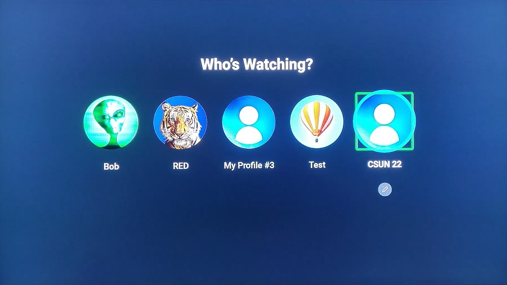
Select a profile screen
The state of steaming video
As of February 2022, 77% of global viewing time for video is spent watching on demand content: source.
Global viewing time for video
Type of video
Time spent watching
Live TV
23%
On demand video
77%
In 2021, 78% of US consumers had a video on demand subscription. That’s a 50% increase in the number of subscribers over the last six years: source.
US consumers with a streaming video subscription
Year
US Consumers
2016
52%
2017
64%
2018
69%
2019
74%
2020
78%
2021
78%
Demand for streaming video services is not only growing, it’s here to stay as more and more providers enter the market each day. But how accessible is this flood of new apps?
Case study: discovery+
Our team had the opportunity to test the discovery+ streaming video app across multiple devices to explore the differences in implementation and the support for assistive technology built into the platforms.
We used the Web Content Accessibility Guidelines (WCAG) version 2.1 AA success criteria as guideposts for our review since separate guidelines for mobile accessibility are not yet available. Based on what we encountered during accessibility testing, we comprised a list of the top 10 accessibility concerns focused on the application UI—issues that impede disabled people from completing common user journeys:
Sign in
Explore what is available
Select a show to watch
Add and remove shows to/from My List
Start watching
Top 10 app UI accessibility concerns
Controls need to have an accessible name and an appropriate role.
Provide a visible focus indicator on interactive controls.
Ensure app works with multiple input modes: screen reader, remote, voice input, external keyboard.
Notifications should be announced to all users.
Control focus under actions.
Grouped controls needs a name.
Announce the number of items in a group.
Provide sufficient color contrast between the text and the background (image).
App should support zooming and resizing text.
Do not restrict the device to only one orientation.
Accessible content
While our research focused on the functional accessibility of the app, an app is only as accessible as the content it provides. You can have the most intuitive, well-designed interface for finding streaming video content but fail to provide appropriate alternative content for disabled users. Let’s look at three content-related considerations.
Captions
Captions are required on streaming content in the US by the 21st Century Communications and Video Accessibility Act of 2010 and other laws. Streaming companies like Netflix went through litigation for not providing captions. All video content we encountered on the discovery+ app had closed captions and controls for turning them on or off.
While captions are now standard and expected by consumers, they are not all the same. Captions must be of high quality and accurate to be useful and provide an accessible experience. Autocaptions that are not reviewed and edited are rarely good enough on their own.
We should also consider other user needs for accessible captions and ways we can enable users to control their captioning experience. Consider providing caption settings where users can control the color, font, size and position of captions and subtitles.
Audio description
Audio description is a separate audio track for video content that describes what is occurring on screen including text overlays and important actions. Like captions, users need accessible controls for enabling the audio description track.
None of the videos we encountered on the discovery+ app had audio descriptions, which is not uncommon but does exclude users who are blind or low vision. Companies are now engaged in legal action over audio description including a settlement between the American Council of the Blind (ACB) and Hulu; and structured negotiations between ACB and Netflix as well as ACB and WarnerMedia (HBO Max).
ACB runs the Audio Description Project that has a searchable database of audio described titles by streaming service.
Voice input
Voice input is a means of controlling the application with voice commands. Only two of the devices we tested support voice input and neither was capable of fully controlling the discovery+ app. This is due to a mix of what the platform supports and what the application supports. To the extent available, we recommend implementing voice support in streaming video applications. Voice input aids in navigating the application as well as making on-screen data entry easier, such as a natural language query to search for content.
Accessibility testing
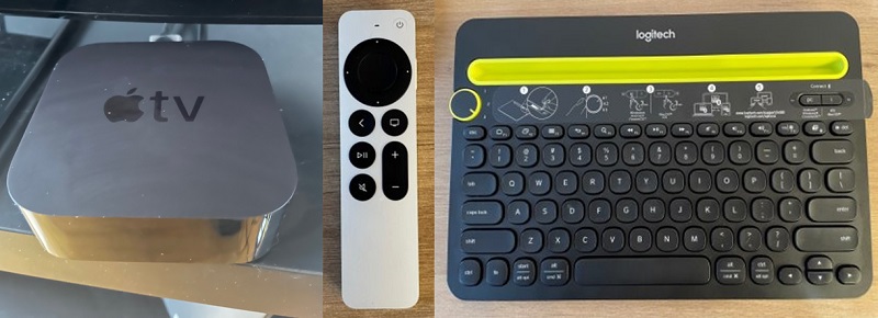
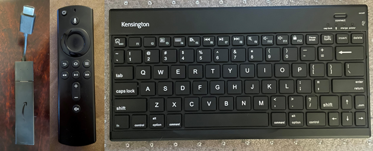
We included five devices and platforms in this review:
Apple TV console, remote with track pad and Bluetooth keyboard
Apple TV findings
Profile buttons do not have accessible names or roles that distinguish them.
Notifications when a show is added or removed to or from a list are not announced.
Carousels lack names.
Rule
Status
1. Controls have accessible names/roles
Fail
2. Focus indicator on interactive controls
Pass
3. Support multiple input modes
Pass
4. Announce notifications
Fail
5. Focus management
Pass
6. Control groups have names
Fail
7. Groups announce number of items
Pass
8. Text color contrast
Fail
9. Support zooming/resizing text
Pass
10. Allow both screen orientations
N/A
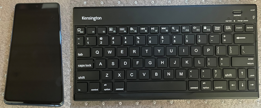
Android phone
Screen reader: TalkBack on Android OS
Samsung Galaxy S20 and a Bluetooth keyboard
Android findings
“Add to My List” and “Remove from My List” controls are missing the button role and accessible names.
Episode selector does not announce the number of items in the control, the button role or selected state.
Most player controls do not have proper accessible names and roles.
Rule
Status
1. Controls have accessible names/roles
Fail
2. Focus indicator on interactive controls
Pass
3. Support multiple input modes
Pass
4. Announce notifications
Pass
5. Focus management
Pass
6. Control groups have names
Fail
7. Groups announce number of items
Fail
8. Text color contrast
Fail
9. Support zooming/resizing text
Pass
10. Allow both screen orientations
Fail
Fire TV
Screen reader: VoiceView on Fire OS
Fire TV stick and remote with a Bluetooth keyboard
Fire TV findings
Profile buttons do not have accessible names that distinguish them.
Tabbed navigation and carousels do not announce the number of items in the group. Episodes announce n of -1.
Shows do not announce their titles which are displayed as images.
Rule
Status
1. Controls have accessible names/roles
Fail
2. Focus indicator on interactive controls
Pass
3. Support multiple input modes
Pass
4. Announce notifications
Pass
5. Focus management
Pass
6. Control groups have names
Pass
7. Groups announce number of items
Fail
8. Text color contrast
Fail
9. Support zooming/resizing text
Pass
10. Allow both screen orientations
N/A
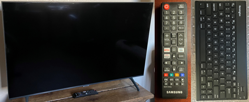
Samsung TV
Screen reader: Voice Guide on Tizen
Samsung TV and remote with a Bluetooth keyboard
Samsung TV findings
Sign In form does not provide audible feedback for input typed with a Bluetooth keyboard.
Low color contrast between text and background images.
Episodes don’t announce the episode number.
Rule
Status
1. Controls have accessible names/roles
Pass
2. Focus indicator on interactive controls
Pass
3. Support multiple input modes
Pass
4. Announce notifications
Pass
5. Focus management
Pass
6. Control groups have names
Pass
7. Groups announce number of items
Pass
8. Text color contrast
Fail
9. Support zooming/resizing text
Fail
10. Allow both screen orientations
N/A
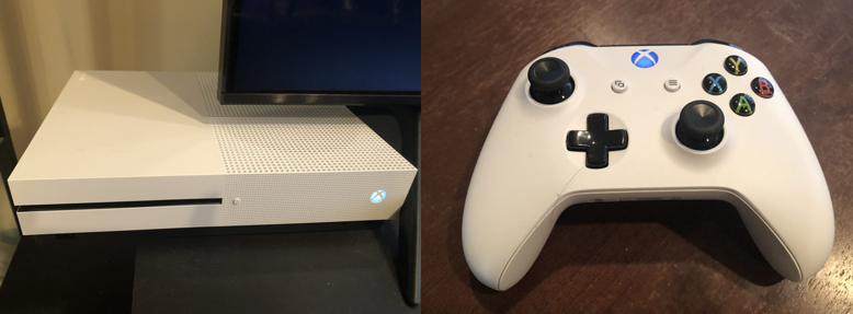
Xbox
Screen reader: Narrator on Xbox software system
Xbox console and controller
Xbox findings
Content is grouped, group label is announced, Tabbed navigation announces the number of items in the group, for example 3 of 10.
Visual notifications are not announced.
Regular text does not have sufficient contrast with its background.
Rule
Status
1. Controls have accessible names/roles
Pass
2. Focus indicator on interactive controls
Pass
3. Support multiple input modes
Pass
4. Announce notifications
Fail
5. Focus management
Pass
6. Control groups have names
Pass
7. Groups announce number of items
Pass
8. Text color contrast
Fail
9. Support zooming/resizing text
Pass
10. Allow both screen orientations
N/A
Overall findings
Every platform tested had issues, with Samsung TV and Xbox having the most accessibility support and Apple TV and Android having the least.
Rule
Apple TV
Android
Fire TV
Samsung
Xbox
1. Controls have accessible names/roles
Fail
Fail
Fail
Pass
Pass
2. Focus indicator on interactive controls
Pass
Pass
Pass
Pass
Pass
3. Support multiple input modes
Pass
Pass
Pass
Pass
Pass
4. Announce notifications
Fail
Pass
Pass
Pass
Fail
5. Focus management
Pass
Pass
Pass
Pass
Pass
6. Control groups have names
Fail
Fail
Pass
Pass
Pass
7. Groups announce number of items
Pass
Fail
Fail
Pass
Pass
8. Text color contrast
Fail
Fail
Fail
Fail
Fail
9. Support zooming/resizing text
Pass
Pass
Pass
Fail
Pass
10. Allow both screen orientations
N/A
Fail
N/A
N/A
N/A
Conclusion
This article represents data for a single app only and we encourage the community to research other applications across additional platforms and devices to add to the body of knowledge. Our goal was to surface specific accessibility issues that have a critical impact on a user’s ability to navigate the journey from signing in to watching a show. We hope this creates visibility and awareness of the effects from not testing for, and fixing, accessibility issues in streaming video applications and helps inform the pool of best practices for inclusive streaming experiences.