YNAB adds a Home screen to its iOS mobile app; but is it accessible?

I’m a longtime YNAB (You Need a Budget) customer. I use their monthly planning software every day to track my expenses and manage my budget. I’ve written about their webapp accessibility previously and noted over the years that they have made updates to improve the experience for disabled users, such as adding dark mode support.

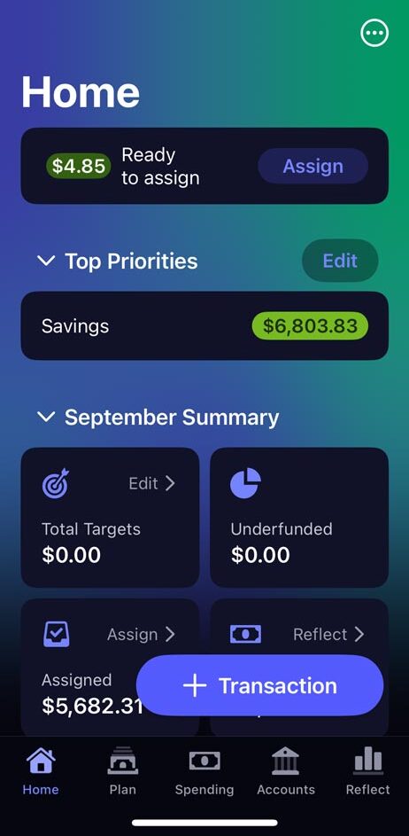
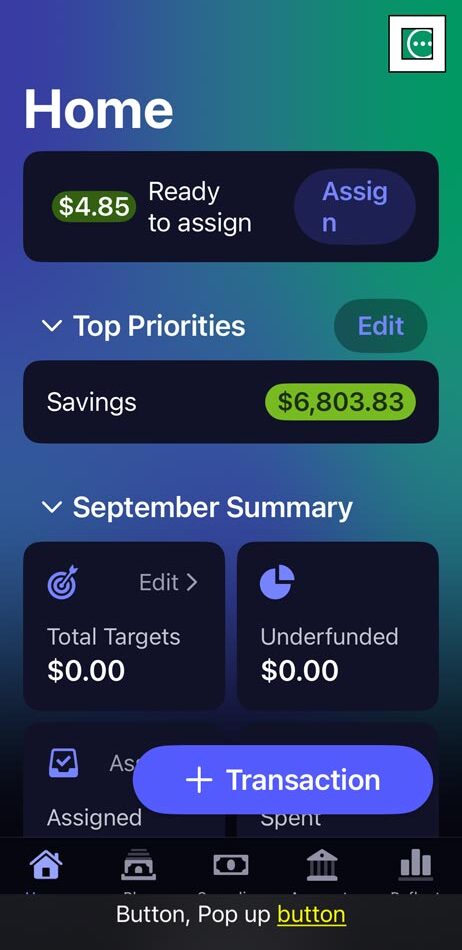
Yesterday when I opened the app, I noticed it looked different. The bottom tab bar navigation changed and the new first tab was called “Home” with a screen that looks something like a dashboard.

YNAB home screen showing money available to assign, top priority of savings and a September summary of budgeting and spending

Whenever I see something new in an app I use frequently, I like to turn on the VoiceOver (VO) screen reader on my iPhone 12 mini and explore the interface. I found a few critical issues where VO users simply cannot access some controls, as well as a few other Level A failures that should be addressed soon.

I did notice that YNAB put out an updated release this morning to Version 25.26 which has fixed some other issues, such as the “Transaction” button not having an accessible name of “Add Transaction” even though it relies on the plus icon for sighted users to understand the button’s purpose.

Let’s look at one of the critical issues YNAB should resolve to make the new “Home” screen more accessible.

Assistive technology users cannot select options from the ellipsis button context menu

In the upper right of the screen is a circular button with an ellipsis icon in the middle. The button doesn’t have an accessible name but does announce the “button” trait/role so VO users know its interactive and the “pop up button” attribute so VO users know the button will open a menu.

screenshot of the ellipsis button on the YNAB Home screen. VoiceOver caption panel shows an announcement of button, pop up button.

When I double-tap the unnamed button, a context menu opens with four available actions: Open Plan, Hide Amounts, Support and Settings & Privacy. When the menu appears on screen, focus moves to the first item in the list, “Open Plan”. While the “Open Plan” control is missing the button trait/role, it can be double-tapped by VO users to activate.

Unfortunately, assistive technology (AT) users cannot access the other three controls below “Open Plan”. When a VO user swipes to go to the next option in the list, focus moves outside the list to a button with an accessible name of “Dismiss context menu”. VO users cannot swipe to other content on the screen because focus is trapped. Their only option is to dismiss the menu to continue.

screenshot of the YNAB home screen with the ellipsis context menu expanded to show four options. VoiceOver is stuck on an invisible button announcing Dismiss context menu, button.

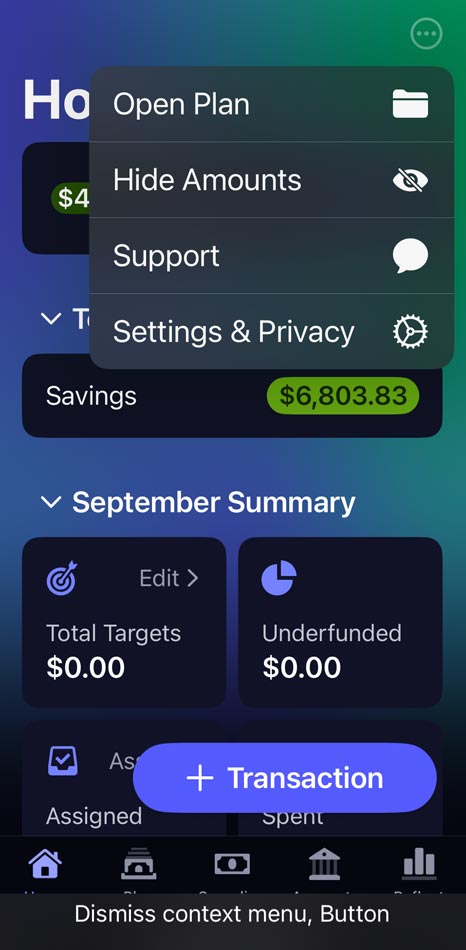
I tried accessing the menu options using a Bluetooth keyboard and Voice Control speech input but was unable to select any of the menu options using those AT methods. This menu is actually a keyboard trap as keyboard users cannot close the menu to continue on the “Home” screen and have to restart the app. Here’s a video of the VO interaction with the ellipsis button and context menu

The overall accessibility of the new “Home” screen is pretty good but the design seems to break down when there are more complex controls. It’s great that YNAB has an accessibility statement on its website; I’d like to see a link to that in the mobile app too, along with the new Accessibility Nutrition Labels listed in the App Store.

Podcasts App Changes in iOS11

I’ve written about my frustrations with the iOS Podcasts app on the iPhone before. With iOS11, Apple decided to change how the interface works in a major way (again). I had adapted to the iOS9 UI, easily adding items to the “Up Next” queue and figuring out that I could reorder and delete episodes.

Queue Management

What I want from a podcast app is to be able to create a queue of episodes that I can manage by adding/removing/reordering with ease.

screenshot of the podcasts app player screen
Play episode screen

As with the previous version of the app, you tap the menu icon in the lower right to bring up play options.

Episode menu screen
Screenshot of menu options for an episode

The options under this menu have changed. No more history and no way to see the contents of the queue. You can choose to play the current episode next with the “Play Next” option or add it into the black hole queue with “Play Later”.

screenshot of the added to queue notification for a podcast episode
Added to queue notification

I say black hole because I cannot find the queue.

It’s hard to use this app if I can’t manage which episodes are playing. I’ve already had times where I added an episode twice or wanted to play a different episode before another one I just added to the queue. I’m stumped and upset.

Library

Some readers may have noticed there is a new option in that menu called “Add to Library”. I was really hoping the library was the queue. Instead it appears to replace the “My Podcasts” icon from the previous app version. Best I can tell, this is a list of the latest episodes the podcast thinks you would be interested in.

screenshot of the Library where you can sort through episodes
Library screen

It is useful for navigating podcast feeds and episodes with the option to download to your device.

Listen Now

This was my last hope. I really thought this would be a list I could curate, but again, disappointment.

screenshot of the Listen Now screen which lists the latest podcast episodes
Listen Now screen

What we see is another list of latest episodes which I think excludes ones you’ve listened to already. So where is the queue? I guess it’s time to search for the answer. The first hit had a great response:

The fact that we have to Google how iOS screen design works shows how iOS screen design doesn’t work any more. I hate iOS 11.

The answer for how to view the queue–swipe up on the screen where the current episode is playing–isn’t working for me. I guess I’ll keep trying but seriously, I don’t understand why Apple obfuscates functionality with obscure gestures.

Update: So if you have episodes in the queue, you can scroll to the bottom of the currently playing episode screen to see what’s “Up Next”. However, if you have nothing in the queue, the section simply isn’t there.

screenshot of the Up Next queue at the bottom of the player screen
Up Next list

My design suggestions would be to make the queue more obvious and to call it a queue. I’d love to see a “Queue” icon at the bottom of the app. Calling it “Up Next” is confusing.

Did I watch that already?

I use the Netflix iOS a lot. I’ve watch a lot of stuff and need to find new videos to watch. This app doesn’t facilitate that user task very well.

Screen shot of the Netflix iOS movie selection pattern
Screen shot: Selection page in the Netflix iOS app

Design Suggestions

  1. Make it obvious which videos you’ve watched already. Lower the opacity for watched items.
Screen shot of movie tiles with the watched movie grayed out
I’ve watched 13th
  • On the screen for a specific video, give an indication if you’ve watched it already. Lower the opacity of the title image and change “Play” to “Watch Again”.
  • Video page where the play button now reads watch again
    Watch again
  • In settings, add an option to filter out anything you’ve watched. You can still search.
  • Screen shot of the app settings with a toggle switch to remove watched videos from suggestions
    Remove from Suggestions in App Settings
  • Provide a way to mark videos you don’t want to watch so they stop showing up as suggestions. I’ve added a “Skip” icon as an example. Icons are always hard. My first attempt was a “not interested” button but it was too prominent. I think employing the same design as other icons and putting it in line with the “close” icon gives it subtlety and context.

  • Video page with a skip icon and text in the upper left
    Skip option to hide videos

    Once you’ve rated a video, the thumbs up icon turns white and the text “Rate” turned to “Rated”. I’ve followed that pattern with the “Skip” button, filling in the control and changing it to “Skipped”. Tapping this would allow this title to become a suggestion again.

    Video page with the Skipped icon and text in the upper left
    Skipped icon

    Then test it!